Spring-Summer Evergreen Fashion Colors
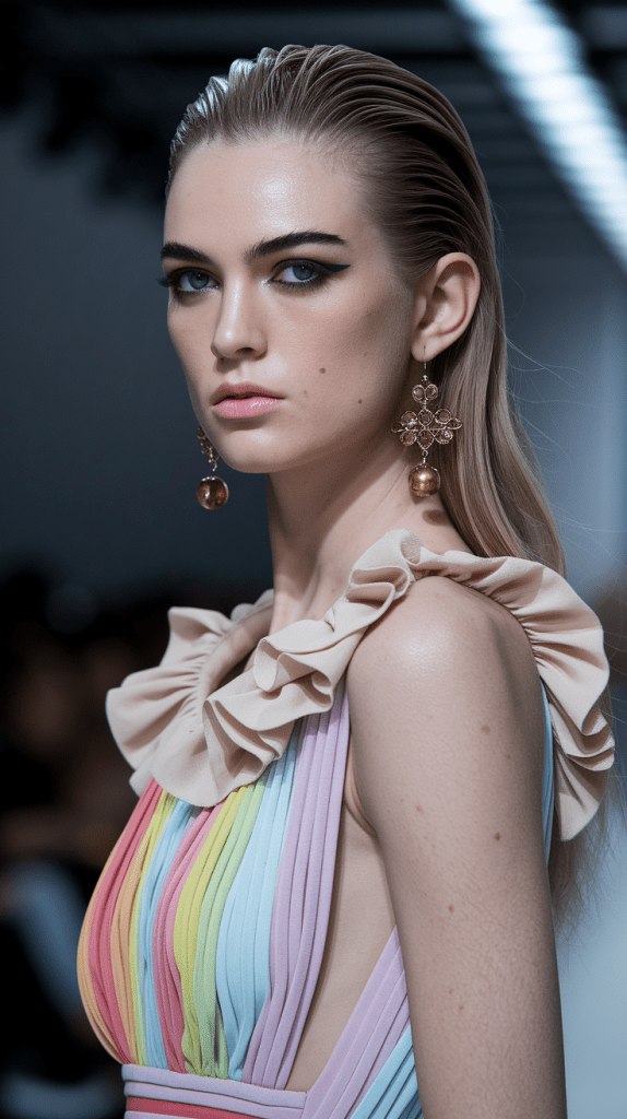
The Spring-Summer fashion colors bring a shift from the bold and vibrant hues of winter to softer, more refined tones.
This season sees the departure of loud, attention-grabbing shades, with colors reminiscent of the calm before a storm, offering a more subdued aesthetic. Gone are the aggressive pinks, and the once dominant strong yellows have been toned down to more delicate shades.
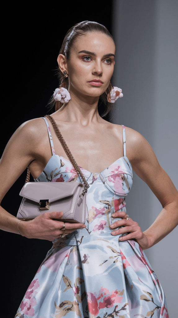
Here are some of the key spring-summer colors to look out for:
- Soft pastels: These colors, while still light and fresh, avoid the overly sweet and sugary tones often associated with pastels.
- Subtle yellows and greens: These colors emerge in a calmer, more muted form compared to their bold winter counterparts.
- Earthy neutrals: Beiges, taupes, and off-whites take center stage, evoking a sense of natural elegance.
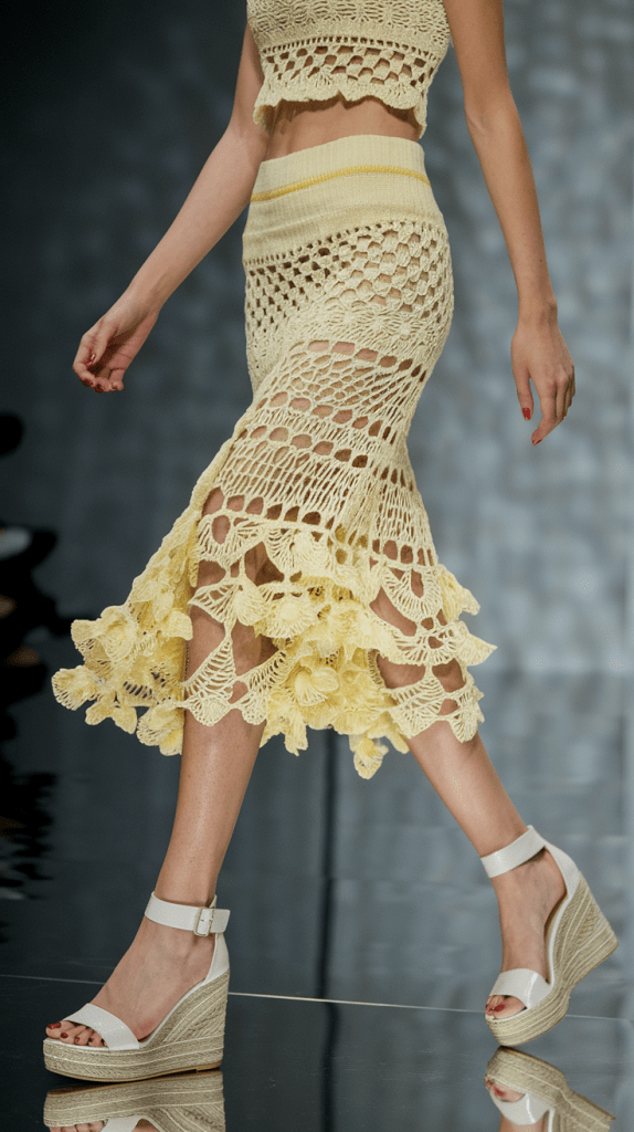
For the warm days, these shades allow you to dress in a more refined and balanced way while staying fashionable. Keep an eye out for these tones in your wardrobe to stay on trend for the coming season!
Disclosure: This post contains affiliate links, which I may earn a small commission from (with no extra cost to you). Thank you for your support!
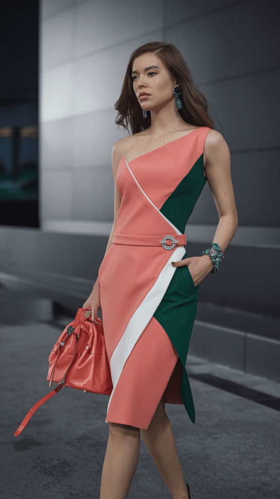
Soft Coral – The gentle and fresh spring color
Soft Coral is a delicate mix of orange and pink, capturing the essence of spring’s freshness and lightness. This color is perfect for spring and summer outfits, offering both elegance and playfulness. A coral dress or blouse brings a cheerful vibe, while adding a fresh touch to daily wear.
Coral has been a mainstay in fashion over the years due to its versatility, effortlessly combining with other pastel shades or even stronger tones like sea green or soft yellow. In the spring-summer season, Soft Coral is especially trendy and makes for an excellent choice if you’re looking for a fresh and youthful piece for the warmer months.
The desert flower, where the endless sand meets the edge of the sky, boasts a surprisingly warm and inviting pink hue. In the relentless sunlight, this flower shines as though it has absorbed all the rays of the sun, dispersing pink tones across the vast landscape.
The petals of the desert flower curl gently, as if stretching in the warmth of the sun. Its pink shade mirrors the soft hues of a sunset, gently embracing the sand dunes and the desert’s dust. This color almost breathes life into the dry surroundings, creating an Eden-like oasis in the heart of the desert.
The beauty of this flower lies not only in its colors but also in its resilience as it thrives in harsh conditions. The warm pink blooms find their strength in the desert’s toughness, proudly bowing against the wind, sandstorms, and sunburn. This flower, with its unique pink splendor, is a true survivor, bringing the beauty and strength of life to the barren desert.
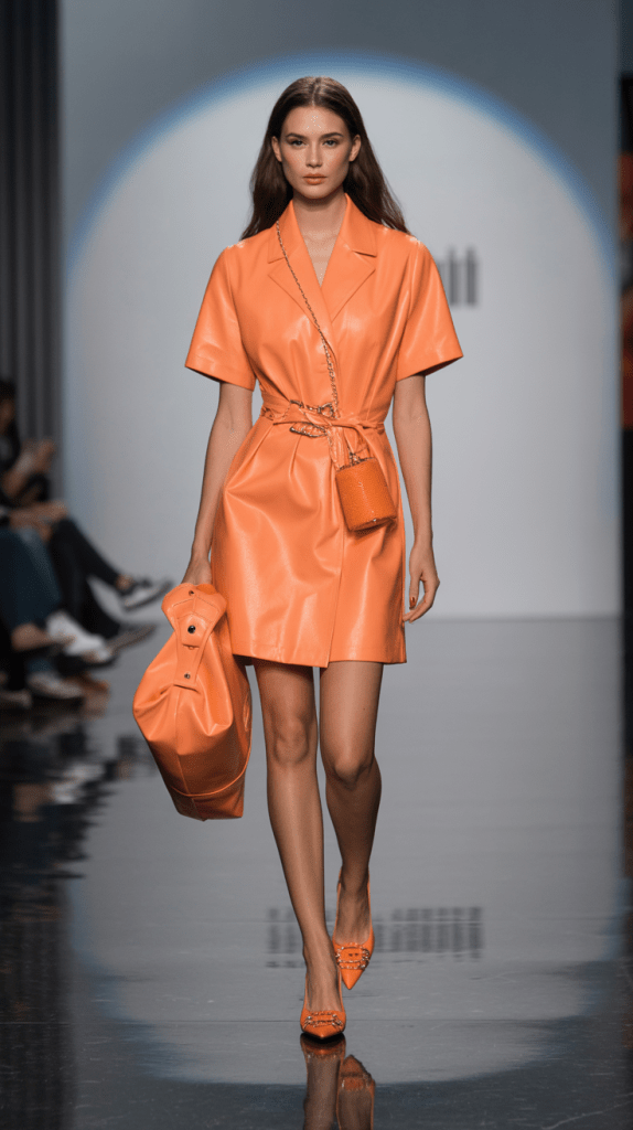
Orange
Blood orange is a vibrant and striking shade of orange, often associated with intensity and attention-grabbing qualities. Its name comes from the combination of “blood” and “orange,” referring to the deeper, darker hues that give it a rich, almost reddish tone.
This color is commonly linked with energy, passion, and vivacity.
In design, fashion, and the arts, blood orange is favored for its boldness. It lends a confident and powerful expression, often used to evoke dramatic or passionate emotions.
Its intense appearance can create a compelling and dynamic visual impact in various contexts.
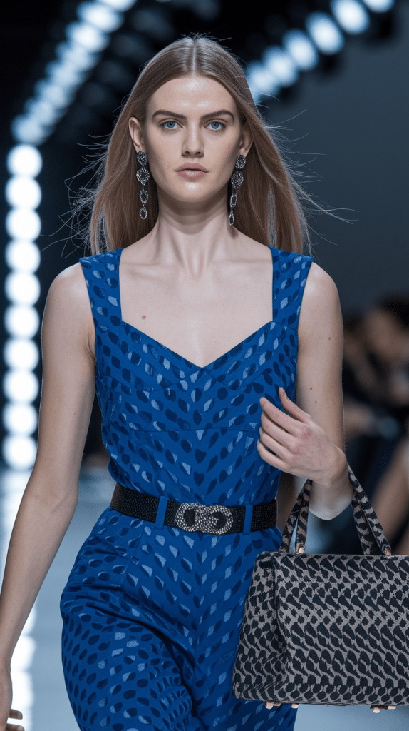
Tropical navy blue
Tropical navy blue is a dazzling, vibrant shade inspired by tropical coastlines and the blue hues of the sky. This color emerges from the combination of deep navy and sky blue, capturing the way sunlight reflects off the surface of the water, creating a beautiful blue glow.
Tropical shades of navy evoke a warm, relaxing environment and radiate harmony with nature.
This particular shade of navy blue exudes freshness and calmness, while also reminding us of tropical paradises and sunny summer days. It’s a color that brings a sense of tranquility and escape, perfect for designs or clothing that seek to evoke a serene, vacation-like feeling.
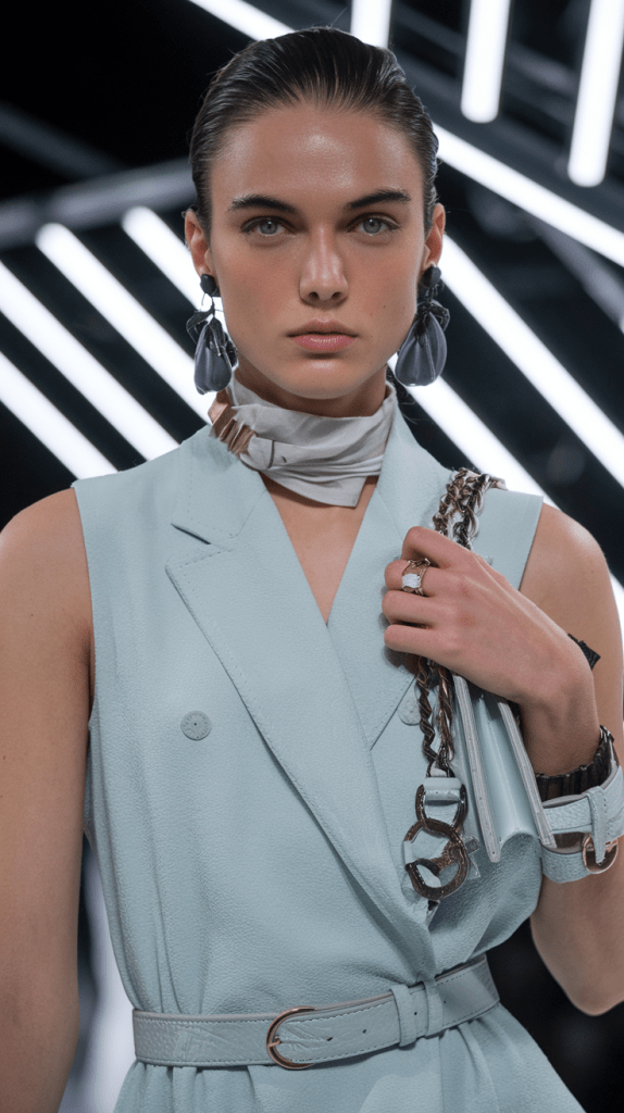
Distressed denim blue
“Distressed denim blue” or “worn-out denim blue” is a popular, faded version of the traditional denim shade. It reflects a vintage or “lived-in” look, achieved through the natural wear and tear of fabric. The color is characterized by its soft, slightly grayish blue tone, which is reminiscent of well-worn jeans that have been exposed to light and time.
This muted blue carries a sense of casual style and authenticity, often used in fashion to create a relaxed, effortless aesthetic. It pairs well with both neutral and bold colors, making it versatile for a variety of casual looks.
In fashion, distressed denim blue adds character to outfits, conveying a sense of comfort and individuality. Whether in jackets, jeans, or accessories, this color continues to be a staple for creating a timeless, yet relaxed vibe.
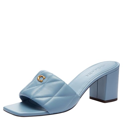
Pale denim blue is a light, subtly pastel shade, representing a softer version of the traditional denim blue. This color is typically less intense and creates a soothing, elegant effect. It evokes the clear beauty of the sky and a sense of natural calm. Pale denim blue is versatile and pairs easily with other colors like white, grey, or earthy tones.
It is often used in fashion and interior design due to its fresh and refined aesthetic, adding a sense of simplicity and tranquility to any environment. This gentle hue brings an understated elegance to clothing or decor, making it a popular choice for both casual and sophisticated looks.
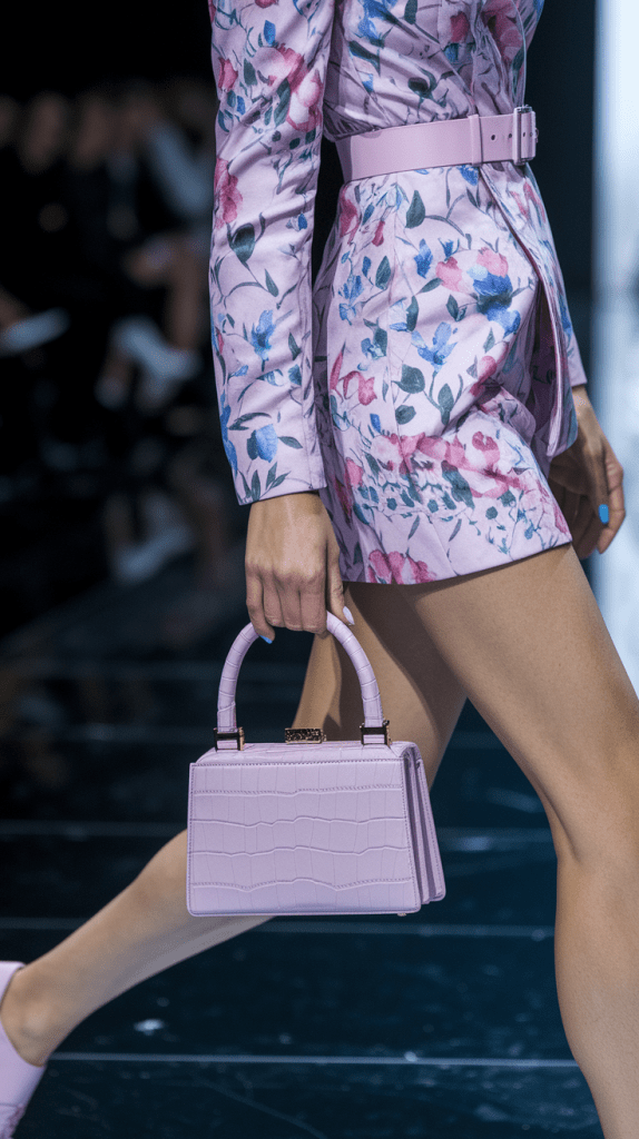
Pastel lavender
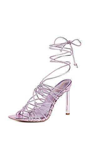
Pastel lavender is a delicate, soft hue that is often associated with lightness, romance, and tranquility. This pastel shade is typically a muted, powdery tone, creating a gentle and calming effect. Lavender, in particular, symbolizes elegance, mystery, and creativity, which enhances its appeal as a pastel color.
The color is frequently linked to springtime flowers like lavender and lilacs, reinforcing a romantic and fresh atmosphere.
Beyond its aesthetic qualities, pastel lavender also conveys a sense of peace and harmony, making it an ideal choice for home décor or fashion, especially when aiming to create a soothing environment.
Because of its subtle nature, pastel lavender pairs well with other pastel shades or neutral colors, creating a serene and welcoming atmosphere. The color is easy to integrate into various settings, whether in soft clothing materials or peaceful interior designs.
It is not only visually pleasing but can also promote emotional well-being, helping to reduce stress and foster a sense of calm.
Mint green
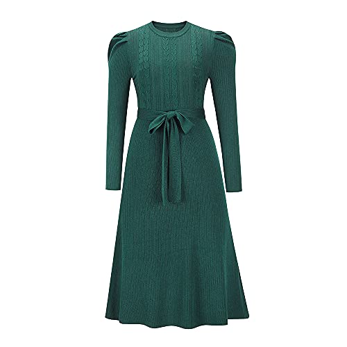
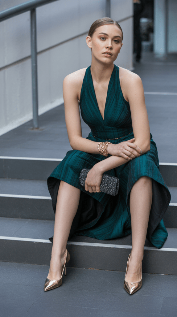
Mint green is a fresh and vibrant shade of green, named after the mint plant, which features leaves and stems of a similar color. This hue is a slightly cool, clear green that evokes a sense of freshness and lightness. Often associated with nature, health, and vitality, mint green is considered refreshing and invigorating.
The color is commonly used in interior design, fashion, and graphic design to create a soothing yet energizing atmosphere.
It symbolizes purity, vitality, and optimism, making it an excellent choice for spaces or clothing intended to lift the mood and promote well-being. Whether used in accents or as the main color, mint green brings a revitalizing touch to any environment.
Lemonade
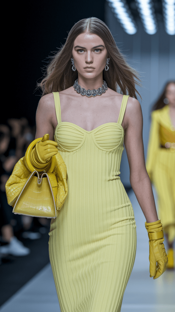
Lemonade yellow is a bright and cheerful shade that often conveys freshness and positivity. Its association with summer and refreshing beverages, like lemonade or lemon iced tea, makes it a color symbolic of lighthearted, sunny days. This shade is a lighter and more vibrant version within the yellow color family, often evoking the warmth and joy of sunlight.
In color psychology, yellow is linked to happiness, optimism, and energy, and lemonade yellow amplifies these qualities with its fresh and invigorating tone. It is widely used in design, fashion, and interior décor to add a lively and rejuvenating atmosphere to a space or outfit.
Lemonade yellow serves as more than just a hue—it embodies a mood of vitality and cheerful optimism, enhancing environments and styles with its sunny disposition.
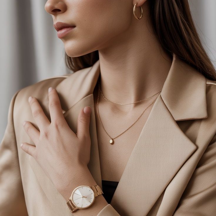
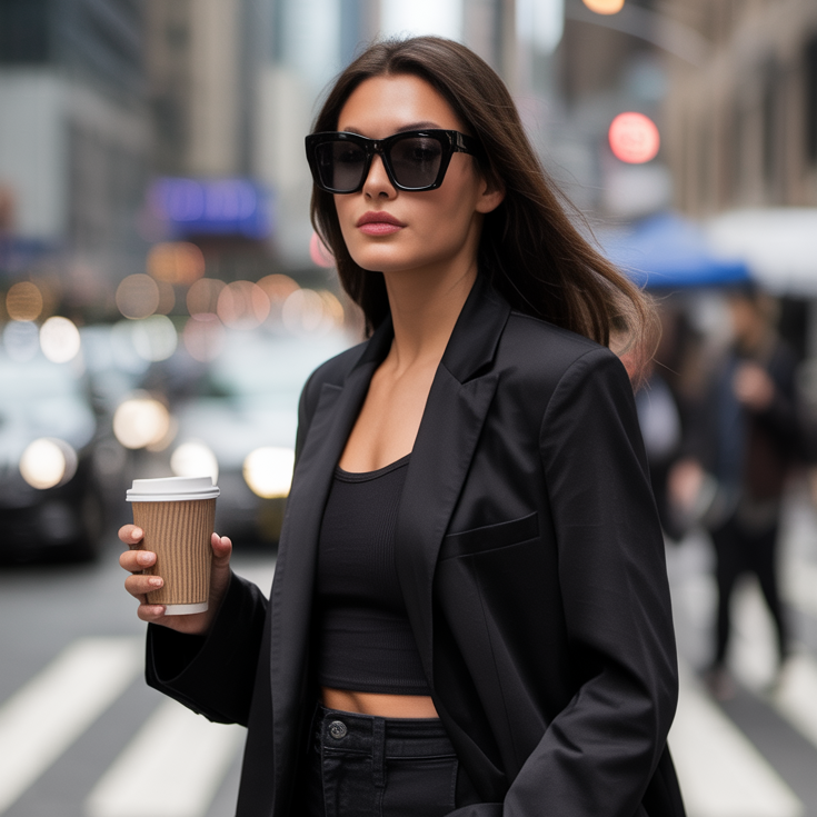
How to Look Rich and Classy: 10 Style Rules That Always Work
(Without Overspending): The Modern Quiet-Luxury Guide Key Takeaways Avoid the biggest giveaways: poor fit, cheap shine, trend-stacking, loud branding. Looking rich and classy is mostly fit, fabric, grooming,…
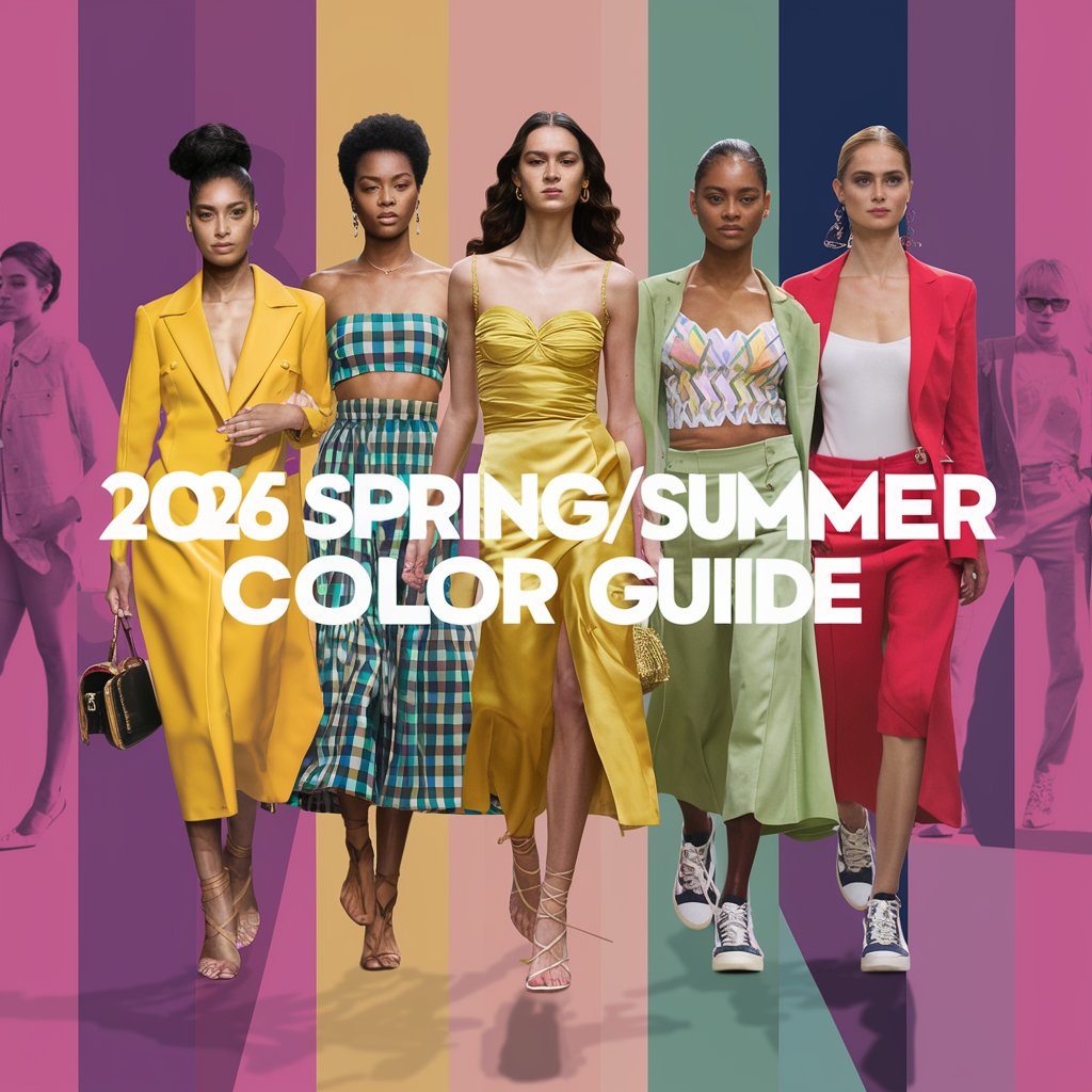
2026 Spring/Summer Fashion Color Guide
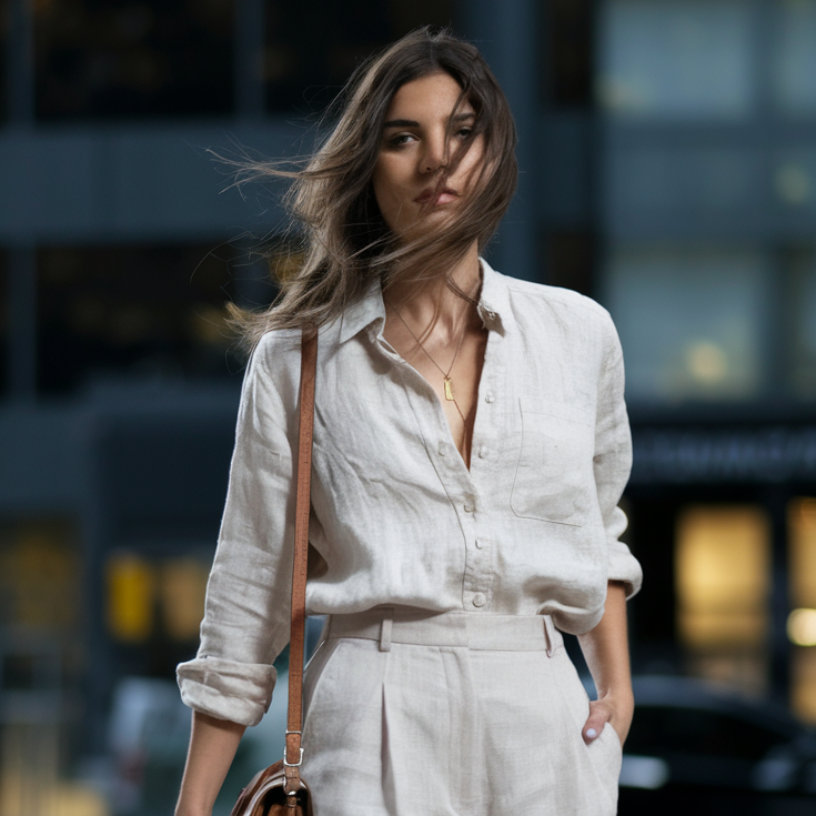
The 12 Fashion Shades That Will Dominate Outfits Everywhere Spring/Summer 2026 doesn’t arrive loudly. It slides in like sunlight on clean sheets—soft, bright, effortless. Fashion gets…
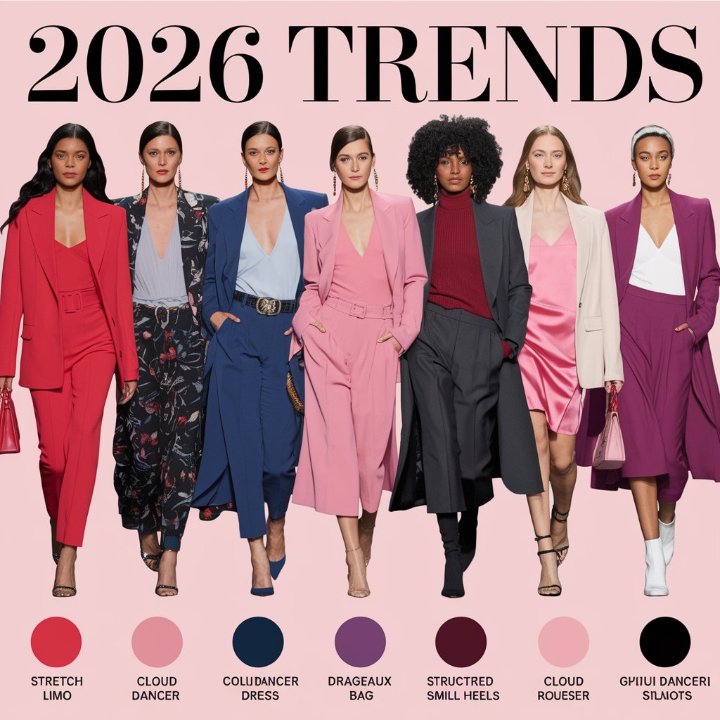
2026 Fashion Trend Colors
The Pantone-Inspired Palette Guide You’ll Actually Use Air feels different in 2026. Softer. Cleaner. Less noise, more intention. The year’s color direction isn’t screaming for attention—it’s…
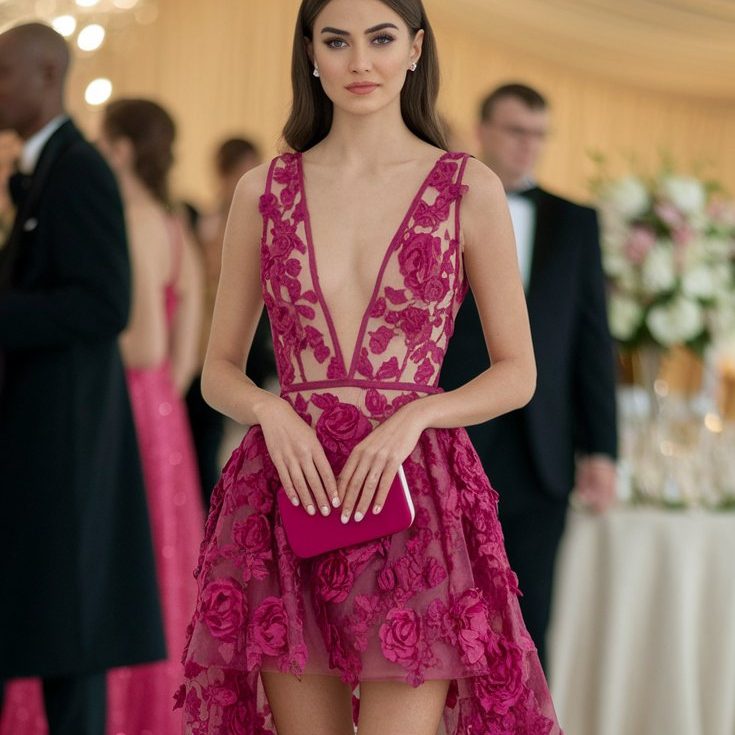
15 Best Lace Bridesmaid Dresses That Redefine Modern Weddings
Why Lace Is the Strongest Bridesmaid Trend This Year Lace sits perfectly at the intersection of tradition and modern fashion. It carries craftsmanship, detail, and heritage…
15 Extravagant Urban Outfits for City Girls
Extravagant Urban Outfits for City Girls Who Refuse to Blend In Casual Chic, But Make It Dangerous Casual chic used to mean safe.Neutral. Predictable. Easy to…
15 Casual Chic Women’s Looks
Effortless Style That Works in Real Life The New Definition of Everyday Chic Casual chic is no longer a trend — it’s a response. A response to busy…
12 Black Blazer Outfit Ideas
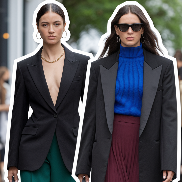
12 Black Blazer Outfit Ideas That Feel Expensive, Unexpected, and Effortlessly Powerful The black blazer is one of those rare wardrobe pieces that never disappears. Trends…
RELATED POSTS
- How to Look Rich and Classy: 10 Style Rules That Always Work
- 2026 Spring/Summer Fashion Color Guide
- 2026 Fashion Trend Colors
- 15 Best Lace Bridesmaid Dresses That Redefine Modern Weddings
- 15 Extravagant Urban Outfits for City Girls
- 15 Casual Chic Women’s Looks
- 23 Best Wedding Guest Outfits for Spring–Summer
- Modern Old Money Style for Women Over 50
