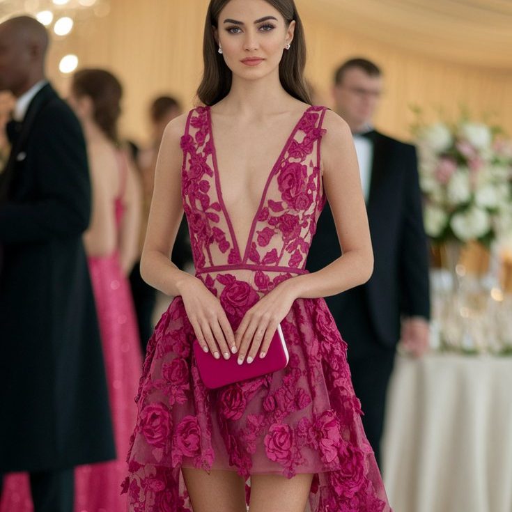
Colorful Dress – How to Harmonize the Colors?
Why Color Matters in Fashion
Color is more than a trend — it’s emotion, memory, and self-expression woven into every thread you wear. A black dress can make you feel strong, a white one serene — but a colorful dress? That’s happiness translated into fashion. It’s energy you can wear.
Color tells stories before you ever say a word. It shapes mood, defines personality, and instantly captures attention. From soft blush to electric blue, the shades you choose reveal more about you than any label ever could.
✨ Table of Contents
- The Power of Color Psychology – What your favorite shades say about you
- Understanding Color Harmony – How to mix hues like a stylist
- Finding Your Perfect Palette – Colors that flatter your undertone
- The Rule of Three – Balancing dresses, outfits, and accessories
- Styling Colorful Dresses – Step-by-step fashion guidance
- Secret Color Formulas – Easy combinations that always work
- Seasonal Outfit Inspiration – Spring, Summer, Fall, Winter looks
- Accessorizing Like a Stylist – Shoes, bags, and jewelry tips
- Common Mistakes – What to avoid when wearing bold colors
- Color Stories by Style – From boho to minimalist elegance
Why Color Defines Fashion
In the world of fashion, color is your first impression. Before the cut of a dress or the sparkle of a necklace, people notice hue. A colorful outfit becomes your personal brand — a silent language that says who you are and how you feel.
Each color radiates energy: pink whispers tenderness, red demands attention, blue brings calm, and yellow lights up a room. When you combine them in harmony, you create balance — and that’s the essence of great style.
In 2026 fashion, designers are celebrating that language again. After seasons of muted tones and minimalism, color is making its comeback — vibrant, joyful, and unapologetically expressive. The runways glow with mint greens, coral reds, pastel lilacs, and sun-washed yellows. These tones don’t just follow trends; they awaken emotions.
Wearing color isn’t about perfection — it’s about confidence. It’s about choosing the shade that matches your mood, not just your shoes. A colorful dress can transform your day, not because it’s trendy, but because it reflects how you want to feel.
Maybe it’s the way a turquoise maxi flutters in summer wind.
Maybe it’s the quiet power of a crimson slip dress under city lights.
Or maybe it’s the playful pastel sundress that makes you smile in your own reflection.
When color feels right, you feel right.
This blog series will guide you through that transformation — showing you how to harmonize shades, balance contrast, and dress with meaning. You’ll learn how to build colorful outfits that look intentional, expressive, and effortlessly stylish.
Because color harmony isn’t just about what looks good together — it’s about what feels right together.
So let’s dive deeper into the world where fashion meets emotion, and every colorful dress becomes a reflection of your brightest self.
The Power of Color Psychology
Have you ever noticed how simply changing the color of your dress can transform your entire day? You slip into a red dress and suddenly feel fearless. A soft lilac outfit, and you move a little slower, gentler, calmer. That’s not coincidence — that’s color psychology at work.
Color has vibration, and fashion is how we translate that vibration into self-expression. When you wear a colorful dress, you’re not just choosing fabric; you’re choosing an emotional frequency. Every shade triggers a reaction — in you and in everyone who sees you. Knowing what each color communicates lets you build outfits that not only look beautiful but also feel aligned with your energy.
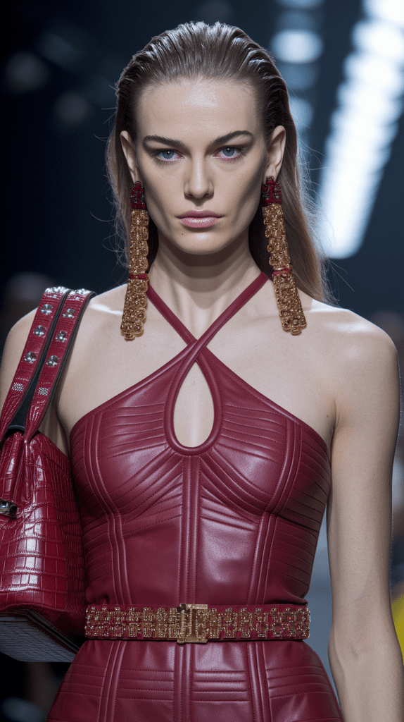
Red – The Color of Confidence and Desire
Red is the heartbeat of fashion — bold, passionate, and impossible to ignore. It raises energy levels, quickens the pulse, and instantly adds power to your style.
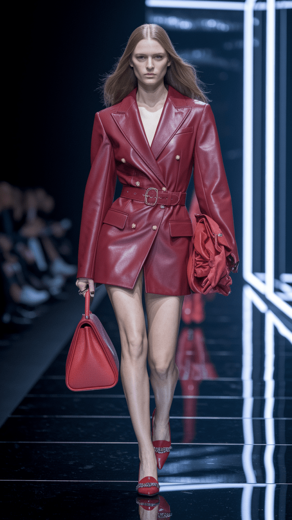
A red dress is perfect for moments when you want to feel unstoppable — a presentation, a dinner date, or that Friday night when you decide the world should notice you. Pair it with neutral accessories to keep the look sophisticated: beige heels, a gold clutch, minimal jewelry.
For 2026, red tones shift toward deep cherry and burnt vermilion — a richer, more elegant palette that blends confidence with maturity.
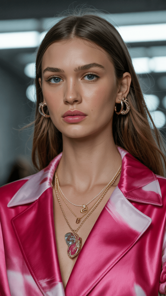
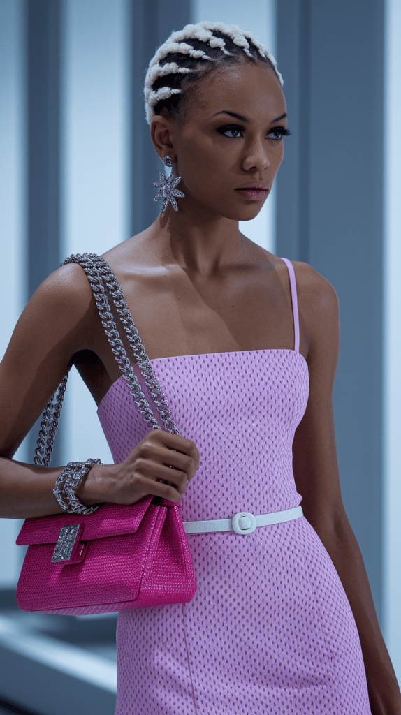
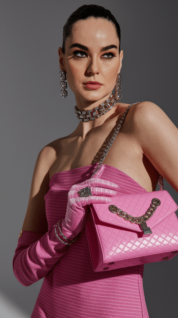
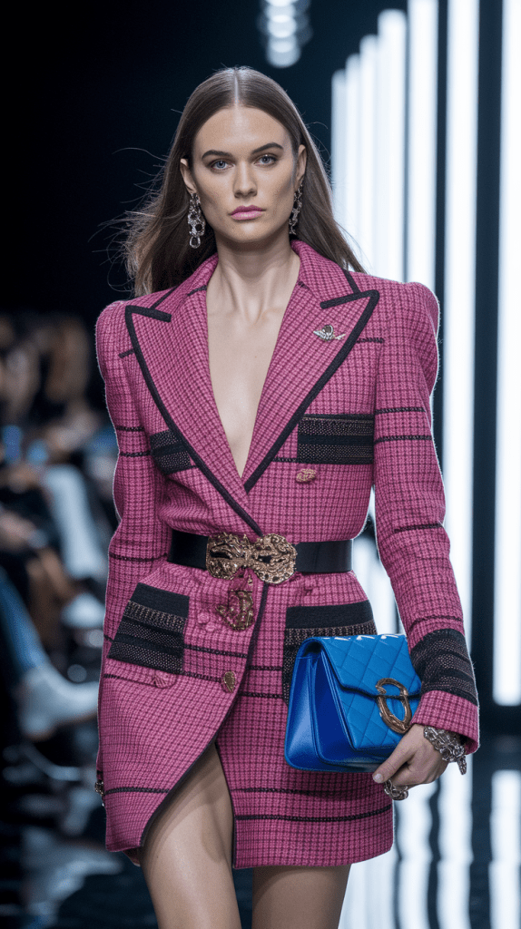
Pink – Romance Reinvented
Pink has evolved from sweet to strong. Once seen as delicate, it now represents self-love, creativity, and compassion.
A pastel pink dress radiates softness, while a fuchsia midi turns heads with fearless femininity. In spring 2026, designers combine pink with orange or lilac for modern color-blocking that feels both playful and grown-up.
To harmonize pink, add a metallic accent — rose-gold jewelry or nude sandals keep the look polished without stealing attention from the hue.
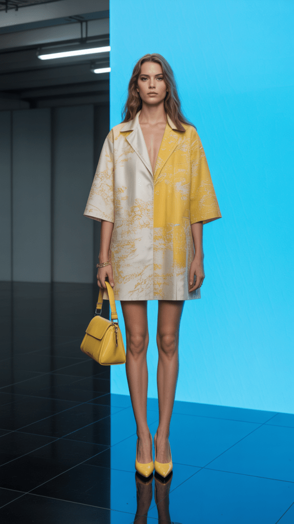
Yellow – The Joy You Can Wear
Yellow is pure optimism. It’s the sunshine in your wardrobe — the instant mood-lifter.
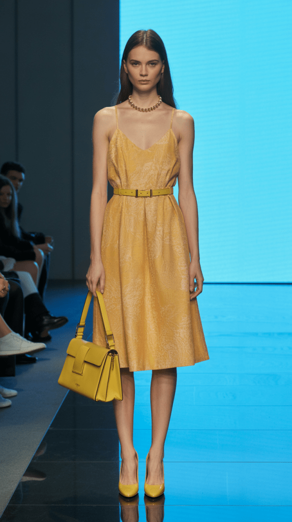
A yellow dress brings life to even the simplest outfit. Whether you choose butter-cream pastels or bold sunflower tones, yellow pairs beautifully with white, tan, and gold. It’s the go-to shade for brunches, vacations, or days you need an extra dose of happiness.
In 2026, expect to see muted honey and lemon sorbet tones dominating spring outfits. They harmonize easily with neutral handbags, woven textures, and straw accessories — perfect for effortless colorful fashion style.
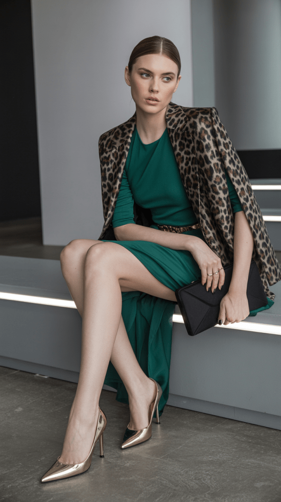
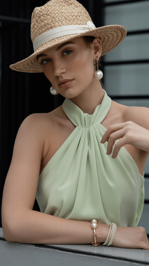
Green – Harmony and Renewal
Green represents balance, growth, and connection to nature. It’s calming yet powerful — a color that refreshes both your look and your mindset.
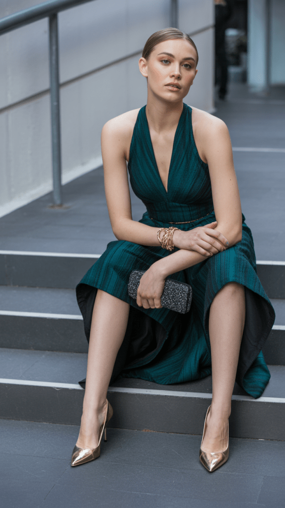
Emerald dresses feel luxurious, sage tones are minimalist, and lime shades are daring and trendy. Combine green with beige, white, or navy for timeless harmony.
For 2026, mint green becomes a must-have — especially for spring outfits and dresses. It flatters most skin tones and pairs effortlessly with blush, lilac, or light denim for a soft, coordinated fashion style.
Blue – The Shade of Trust and Peace
Blue is universally loved because it feels safe, calm, and intelligent. Wearing a blue dress instantly communicates serenity and confidence.
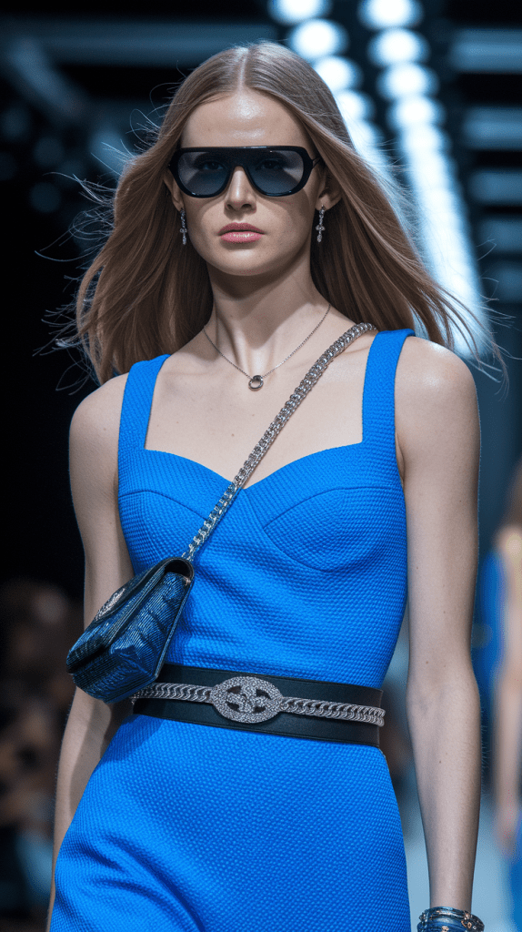
For daywear, try sky blue or powder shades; for evenings, go for royal or midnight blue. Combine with silver, white, or gold accessories for a polished finish.
In the 2026 color forecast, icy blue merges with lavender for a dreamy pastel combination that embodies the “quiet luxury” trend — understated yet deeply elegant.
Purple – Creativity and Mystery
Purple is where imagination lives. It’s artistic, spiritual, and sophisticated. A violet or plum dress exudes mystery without being overpowering.
Pair purple with neutral tones like taupe or soft gray to maintain balance, or with pink and coral for a bold fashion statement.
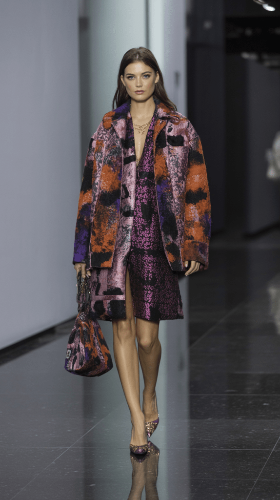
Designers in 2026 reimagine purple through lavender mist and orchid haze — lighter interpretations that add romantic depth to spring colorful dresses.
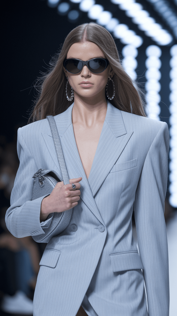
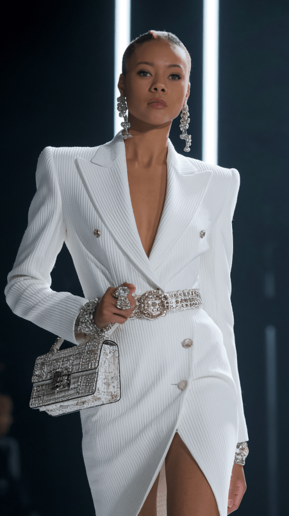
White & Neutral – The Balancing Canvas
No color harmony works without neutrals. White, beige, cream, and gray provide space for bright hues to breathe. They tone down bold outfits, turning chaos into chic minimalism.
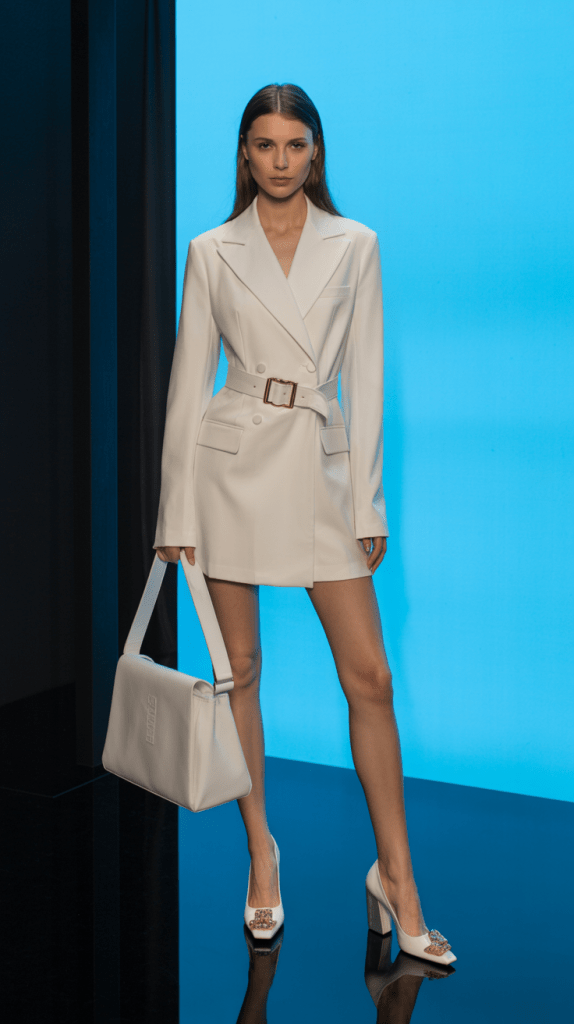
When you wear a colorful dress, grounding it with neutral accessories — a nude bag, ivory jacket, or tan belt — keeps the focus where it belongs: on the color itself.
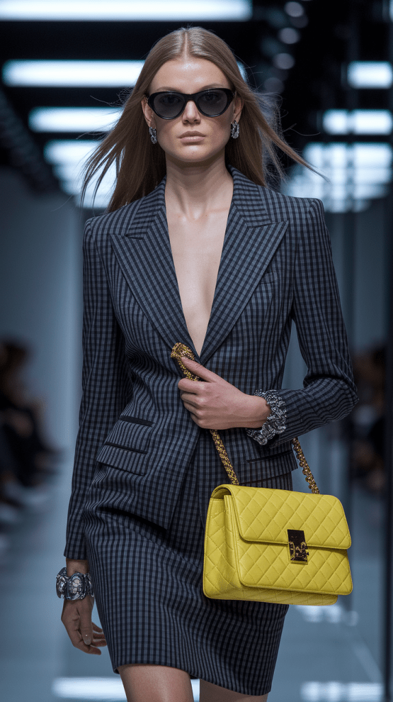
Black – The Modern Contrast
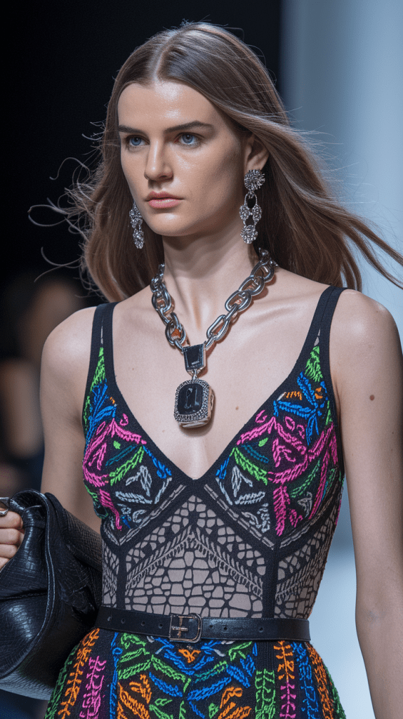
Black isn’t technically a color, but in fashion it’s the anchor. It adds definition and structure to bright looks. A colorful floral dress with black heels or a black leather jacket instantly becomes more dramatic.
In 2026, pairing black with color is trending again — think hot-pink dresses with black belts, lime-green outfits with black boots. It’s edgy yet elegant, perfect for night-out fashion style.
How to Use Color Psychology in Your Everyday Style
When planning your colorful outfits, ask yourself: How do I want to feel today?
- Need motivation? Wear red.
- Want peace? Choose blue.
- Craving confidence? Go for emerald or plum.
- Looking for joy? Yellow or coral never fail.
Fashion isn’t random — it’s energy management through aesthetics. Once you master how colors affect mood and perception, harmonizing your wardrobe becomes effortless.
Understanding Color Harmony
Wearing color beautifully isn’t about luck; it’s about balance. Some combinations instantly look natural, while others seem slightly off, even if you can’t explain why. That balance — the quiet agreement between shades — is what stylists call color harmony.
When you wear a colorful dress, harmony makes it feel intentional, polished, and effortless. The colors don’t compete; they flow. Achieving this balance doesn’t require artistic training — just a basic understanding of how colors interact.
The Basics of Color Harmony
Every outfit is a small composition of tones, contrasts, and visual rhythm. Learning the logic behind it gives you control over how your style is perceived.
The foundation of color harmony lies in three key relationships: complementary, analogous, and monochromatic.
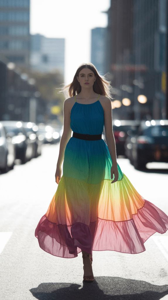
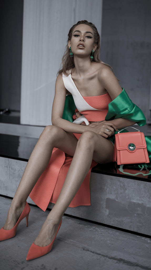
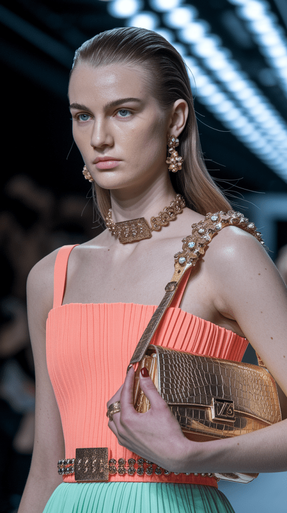
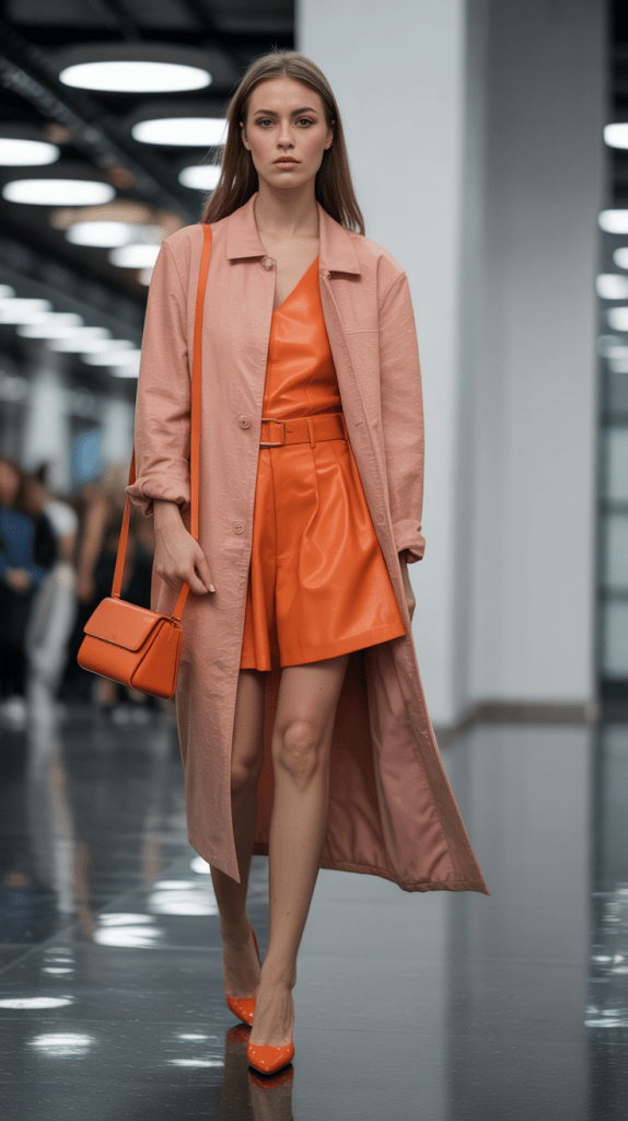
- Complementary colors are opposites on the color wheel — red and green, blue and orange, yellow and purple. When paired, they create strong contrast and vibrancy. For example, a turquoise dress with coral earrings feels alive and balanced, not overpowering.
- Analogous colors sit next to each other on the wheel — such as pink, coral, and red. They blend easily, giving a soft and harmonious impression.
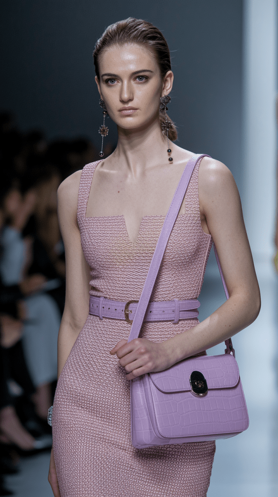
- Monochromatic combinations use a single color family with variations in tone or intensity. A lavender dress with lilac shoes and a deep purple handbag feels cohesive yet sophisticated.
These relationships form the backbone of every well-dressed look, whether it’s a soft pastel outfit or a striking, high-saturation ensemble.
Warm and Cool Tones
Every color carries a temperature. Warm tones — reds, oranges, yellows, corals — feel inviting, cheerful, and energetic. Cool tones — blues, greens, violets — bring calm, elegance, and subtlety.
Wearing warm and cool tones together can create contrast, but balance matters. If your dress is warm, add cool details sparingly — perhaps a turquoise necklace with a coral outfit or silver shoes with a gold-toned dress. Keeping one tone dominant ensures harmony instead of visual noise.
The same applies to your personal undertone. Warm skin glows in earthy or golden shades; cool undertones shine in blues, lilacs, and silvers. When in doubt, use your skin as the guide — it will tell you which palette feels naturally flattering.
Contrast vs. Continuity
Color harmony is also about how much contrast you want. High contrast — such as pairing navy with yellow — feels bold and modern. Low contrast — for example, cream with blush or mint with sky blue — feels romantic and soft.
If your goal is a gentle, feminine look, stay within neighboring shades or muted tones. For a confident, editorial style, increase contrast: deep green with ivory, or royal blue with tangerine.
Your outfit’s purpose should determine your color strategy. Everyday looks benefit from flow and softness, while statement occasions thrive on well-planned contrast.
Neutrals: The Glue of Color
No matter how colorful your outfit, it needs something neutral to anchor it. Neutrals give the eye a place to rest — they are the silent backdrop that lets brighter tones shine.
White, beige, cream, gray, and black act as stabilizers. When styling a bright dress, add one neutral piece to calm the look — a nude shoe, a white blazer, or a subtle handbag. The moment you add a neutral, chaos turns into elegance.
Stylists often use the “one-third rule”: one-third of the outfit in neutral, two-thirds in color. It keeps everything balanced and wearable.
Why Harmony Feels Effortless
When colors harmonize, your outfit feels right without explanation. The eye reads the look as complete. Even bold choices — like magenta with forest green — can appear natural when tones are balanced and the contrast is deliberate.
Harmony doesn’t mean avoiding creativity. It means creating rhythm, much like music — different notes, one mood. You can be colorful without being loud; expressive without being chaotic.
The secret lies in listening to what colors say to each other. Once they agree, your style speaks clearly.
Finding Your Perfect Color Palette
Every woman has a unique relationship with color. Some shades make you glow effortlessly, while others seem to drain your energy no matter how stylish the outfit. The difference isn’t just taste — it’s tone. Understanding your personal color palette is the secret to choosing colorful dresses and outfits that truly flatter you.
Finding your perfect palette doesn’t mean limiting yourself to certain shades; it means discovering which tones highlight your natural features — your skin, hair, and eyes — so every color feels like it was designed for you.
Why Your Undertone Matters
Skin tone is the foundation of color harmony. The easiest way to start is by identifying whether you have warm, cool, or neutral undertones.
- Warm undertones have golden, peach, or olive hues. Veins may appear slightly green, and gold jewelry tends to look flattering.
- Cool undertones have pink or bluish hues, with veins appearing more blue. Silver jewelry complements the skin best.
- Neutral undertones are balanced — both gold and silver look equally good, and you can wear a wider range of colors naturally.
If you’re unsure, hold up a pure white fabric next to your face in daylight. If your skin glows and looks brighter, you’re likely cool-toned. If it looks warmer or golden, you’re probably warm-toned. If both seem to work, you might be neutral — the most flexible category for colorful fashion choices.
Colors That Flatter Each Undertone
Once you know your undertone, selecting dresses and outfits becomes much easier.
For warm undertones:
Reach for earthy, golden hues — coral, mustard, peach, terracotta, olive, and warm red. These colors enhance your natural warmth and give your skin a soft, glowing finish. A mustard dress or coral outfit with gold jewelry will always feel balanced and radiant.
For cool undertones:
Go for crisp, icy shades — sky blue, lavender, mint, navy, rose pink, or jewel tones like sapphire and emerald. These hues contrast gently with your skin, creating harmony without overpowering. Try a cool lilac dress with silver accessories for a fresh, polished look.
For neutral undertones:
You can mix from both worlds. Neutrals look especially elegant in balanced combinations like dusty rose, taupe, teal, or soft gray-green. The trick is not to go too extreme — neither overly warm nor overly cold. Think creamy blush dresses, light denim tones, or gentle stone hues.
The Seasonal Color Approach
Stylists often categorize palettes by the four seasons — a classic but practical way to visualize which colorful fashion direction suits you best.
- Spring palettes feature bright, warm, and clear tones — coral, peach, mint, and golden yellow. They suit fair to medium warm skin with golden undertones.
- Summer palettes are cool and muted — soft blues, lavender, rose, and grayish pastels. Perfect for lighter cool skin tones.
- Autumn palettes are rich and warm — burnt orange, olive, rust, and mustard. Best for deeper warm complexions.
- Winter palettes include cool, high-contrast shades — navy, emerald, magenta, and icy white. Ideal for cool or neutral skin with dark hair and eyes.
This system isn’t a rulebook; it’s a guide to what naturally enhances your beauty. Once you know your season, you can start experimenting with color layering, prints, and accessories confidently.
Choosing the Right Color Intensity
Intensity is as important as hue. Some people shine in bright, saturated tones; others look best in soft, dusty shades.
Ask yourself: Do vivid colors make me glow, or do they overpower me? If a hot pink dress feels too strong, try a blush version. If pastel yellow feels too pale, move toward sunflower or amber. Balance your natural contrast — lighter features tend to prefer softer colors, while darker features look stunning in bold shades.
The Fabric Factor
Color isn’t just about pigment; fabric changes perception. A red cotton dress feels fresh and light, while the same color in satin feels bold and glamorous. Matte materials soften colors, while shiny fabrics intensify them. If you’re experimenting with strong hues, start with matte or textured fabrics to keep the outfit balanced.
Building Your Signature Palette
Once you identify the shades that make you feel beautiful, start creating your personal “color library.” Choose five to seven tones that always work for you — your go-to colors for dresses, fashion accessories, and outfits.
Include:
- Two or three base colors (neutral or soft tones)
- Two accent colors (brighter shades that bring personality)
- One or two statement colors (your bold fashion choices for events or unique pieces)
For example, your base might be beige and cream, your accents could be coral and sage, and your statement color electric blue. This small but strategic palette makes mixing and matching effortless.
Finding your perfect color palette isn’t about perfection — it’s about recognition. The moment you find the shades that reflect your natural beauty, getting dressed becomes intuitive. Every colorful outfit feels more personal, every dress more confident, and every reflection more you.
The Rule of Three for Outfit Balance
Even the most striking color combinations can lose their charm if there’s no balance. You’ve probably seen outfits where everything seems beautiful separately — yet together, something feels too loud or confusing. That’s where the Rule of Three becomes a stylist’s best friend.
It’s a simple formula used by designers, editors, and professional stylists: never feature more than three main colors in one outfit. When applied correctly, it keeps your look vibrant yet harmonious, structured yet free. It’s not about restriction — it’s about direction.
What the Rule of Three Means
The principle divides your look into three layers of color importance:
- Dominant color – the main shade that defines your outfit (for example, the dress).
- Secondary color – a supporting hue that complements or balances the dominant one (often accessories or layering pieces).
- Accent color – a detail tone that adds spark and personality (shoes, jewelry, or makeup).
This simple composition prevents the outfit from feeling random. Each color plays a role — one leads, one supports, and one decorates.
Example 1 – Soft Harmony
Imagine a pastel blue colorful dress paired with white sandals and a beige handbag. Blue is the dominant color, white becomes secondary, and beige acts as a soft accent. The look feels calm, breathable, and cohesive — ideal for spring or summer days.
If you swapped the beige for bright orange, the outfit would lose its serenity. A good balance is like music — when the tones complement each other, the outfit feels like rhythm instead of noise.
Example 2 – Bold Contrast
Now think of a deep emerald dress combined with gold heels and a black clutch. Emerald leads as the dominant tone, gold becomes the secondary accent, and black stabilizes everything. It’s bold yet controlled, perfect for an evening event.
Even though green and gold are both rich colors, the presence of black brings structure. That one neutral tone prevents color overload and creates instant sophistication.
How to Apply It in Everyday Fashion
Start by identifying your dominant color — usually the one that takes up the most space. For most people, this will be their dress, jacket, or top. Then decide on your secondary color, which can come from accessories, shoes, or an extra layer like a cardigan or coat. Finally, choose one accent that brings personality — a statement bag, earrings, or lipstick.
The key is proportion. Your main color should make up around 60% of the look, the secondary 30%, and the accent the remaining 10%. This visual ratio keeps your outfit balanced no matter how colorful your fashion choices are.
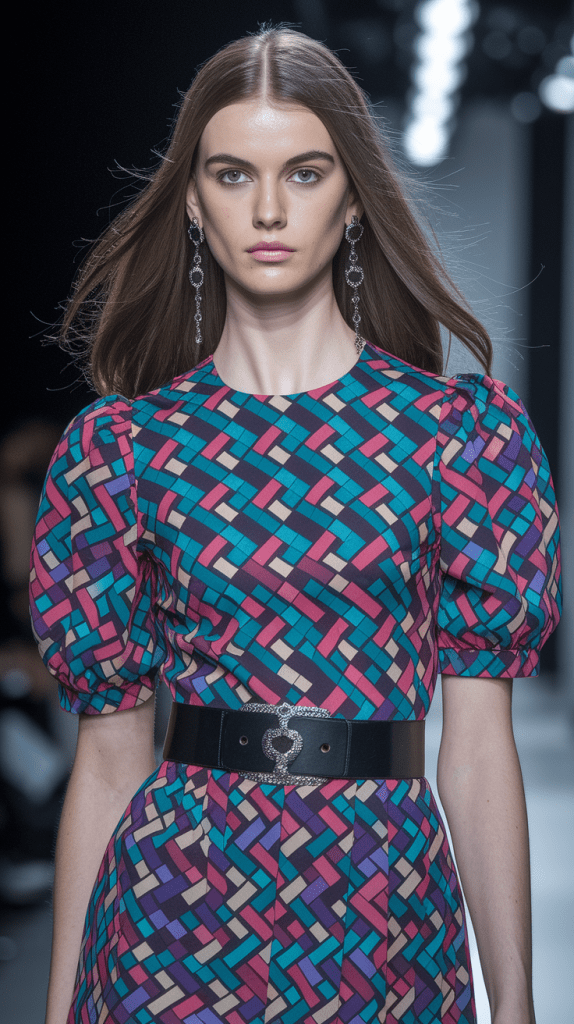
Mixing Prints and Patterns
Prints can complicate color coordination, but the same rule applies. When wearing a patterned dress with multiple colors, treat the most visible shade as your dominant one. Pick accessories in one of the smaller tones from the print to keep everything connected.
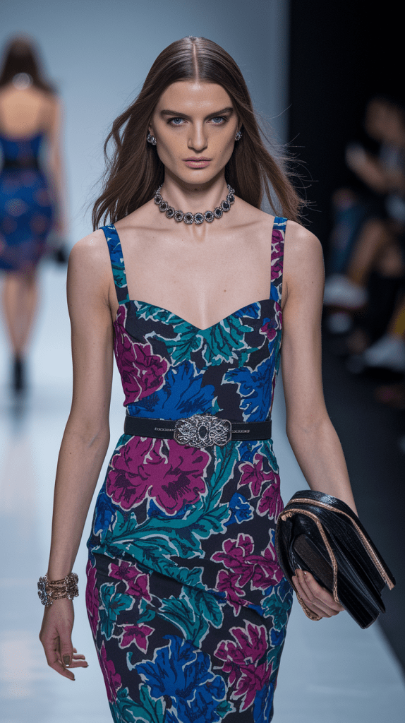
For instance, if your dress features coral, green, and white, let coral be dominant, use green subtly in jewelry or shoes, and keep your bag neutral. This approach maintains the joy of pattern without visual chaos.
Why the Rule Works
Our eyes naturally seek order. Too many unrelated colors cause distraction; too few can feel flat. The Rule of Three strikes the perfect middle ground, giving every outfit structure and purpose.
This is why editorial stylists rely on it so often. Whether it’s a street-style look or a runway piece, the most admired colorful outfits follow the same logic: one main tone, one complement, one spark.
When to Break It
Once you master balance, breaking the rule becomes intentional rather than accidental. Monochrome looks, for instance, play with texture instead of color variety. Color-block dresses might push beyond three shades but stay harmonious because they repeat undertones.
The secret isn’t to avoid color — it’s to understand its rhythm. When you know the structure, creativity becomes effortless.
The Rule of Three isn’t about limitation; it’s about clarity. It lets each shade breathe, ensures your colorful dress stays the star, and gives every outfit the clean, composed feeling that defines modern fashion.
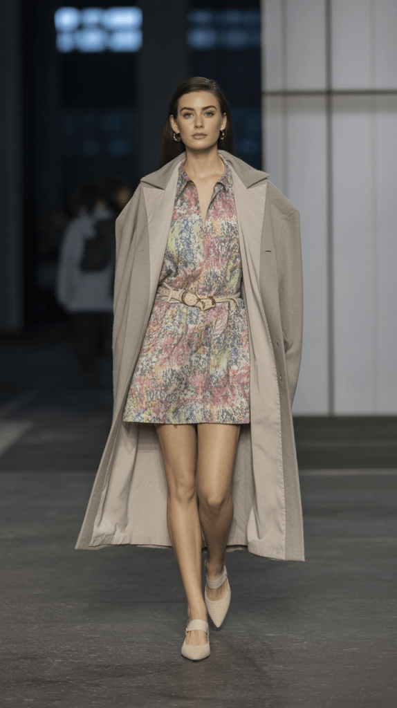
Styling Colorful Dresses: Step-by-Step Guide
Once you’ve chosen the right shades and found your personal palette, the next step is turning those colors into a complete, balanced look. Styling a colorful dress isn’t just about what you wear — it’s about how you combine textures, tones, and details so that the color becomes a statement, not a distraction.
The key is intention. Every element you add — from shoes to lipstick — should enhance the color harmony you’ve already built. Here’s a simple, stylist-approved process to create colorful yet cohesive outfits every time.
Step 1: Let the Dress Lead
When your dress is colorful, it automatically becomes the centerpiece of your outfit. Let it set the tone for everything else.
For example:
- A fuchsia pink dress needs simplicity in accessories — nude heels, minimal gold jewelry, and a neutral bag.
- A mint-green sundress can handle playful pairing — white sandals, pearl earrings, and a woven straw hat for spring charm.
- A deep cobalt evening gown pairs best with metallic heels and a sleek clutch — confident, elegant, and timeless.
When the dress is strong, the rest of the outfit should whisper, not shout.
Step 2: Match the Mood, Not Just the Color
Think about where you’re going and what story you want your outfit to tell. The same dress can shift completely depending on styling:
- For a daytime look, combine your colorful dress with light accessories — beige flats, natural fabrics, and soft makeup.
- For an evening setting, elevate it with bolder contrast — black or metallic shoes, statement earrings, and sleek textures.
Fashion works best when color and mood align. A vibrant red dress might feel playful at brunch with sneakers, but dramatic at night with heels.
Step 3: Use Neutrals as Anchors
No colorful look works without balance. The simplest way to achieve it is by grounding the outfit with neutral pieces.
White, beige, tan, gray, or black accessories act as visual rest points. They calm bright shades and add sophistication.
If you’re unsure, use this quick guide:
- White with pastel tones for softness
- Beige with warm shades for harmony
- Black with jewel tones for elegance
- Gray with icy hues for balance
- Nude with almost anything for effortless style
A colorful dress with one neutral companion piece instantly looks more deliberate.
Step 4: Play with Textures and Fabrics
Color doesn’t exist in isolation — texture changes how it feels. A bright silk dress reflects light dramatically, while the same shade in cotton looks fresh and casual.
If your dress is bold in color, choose matte or natural textures for accessories to avoid visual overload. For example, pair a vivid orange satin dress with tan suede heels, or a hot-pink linen dress with woven or leather accents.
Mixing textures creates subtle contrast that adds depth without adding more color.
Step 5: Coordinate Accessories Thoughtfully
Accessories bring personality but can easily tip the balance. To keep harmony, let one category — shoes, bag, or jewelry — carry color, while the others stay quiet.
If your dress has multiple colors or prints, echo just one of those tones in your accessories. A coral floral dress might work beautifully with a coral clutch or lipstick — repeating the shade connects the look.
Gold and silver jewelry are universal tools for color balance.
- Warm-toned dresses (reds, yellows, oranges) glow with gold.
- Cool-toned dresses (blues, purples, greens) feel polished with silver.
Step 6: Balance Prints and Solids
When styling colorful patterns, keep the rest of your look simple. Let the print breathe. If you’re wearing a multicolor floral dress, choose solid shoes and neutral jewelry.
However, if your dress is a single bold color, you can play more freely — patterned bags, animal-print shoes, or statement earrings can add dimension without overwhelming.
The contrast between solid and print often enhances the beauty of each.
Step 7: Match Your Makeup and Hair Intentionally
Your beauty choices are part of your outfit. The goal is to complement the color, not compete with it.
For bright or warm-toned dresses, go for neutral makeup with subtle bronzer or peach tones. For cool or pastel colors, soft pink or rose shades enhance harmony.
Hair color matters, too. Blonde hair glows with coral and blue; brunettes shine in emerald and red; dark or black hair looks striking in lilac, gold, and turquoise. Adjust accessories and lipstick to echo these natural contrasts.
Step 8: Seasonal Adaptation
Colorful styling changes slightly with the season.
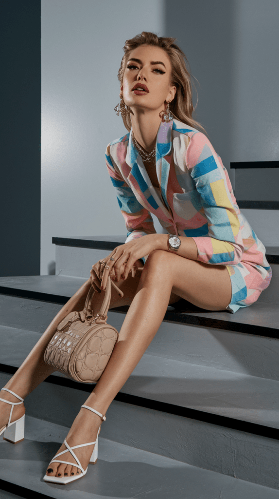
- Spring: light fabrics, pastel tones, gold or beige accents.
- Summer: bright dresses, straw textures, minimal makeup.
- Fall: rich tones like burgundy or mustard, paired with suede and layered accessories.
- Winter: deep jewel colors, metallic finishes, structured silhouettes.
Following seasonal balance keeps your colorful wardrobe feeling natural all year round.
Step 9: Confidence Is the Final Accessory
No styling trick replaces confidence. When you feel good in your outfit, color harmony happens naturally. The dress becomes part of your presence — not something you hide behind.
The more you practice combining shades, the more instinctive it becomes. Soon you’ll reach the point where you can build colorful outfits effortlessly — guided by intuition rather than rules.
Because true fashion isn’t about following trends; it’s about understanding how color speaks your language
The Secret Color Formulas That Always Work
Color harmony might seem mysterious, but in reality, it follows timeless visual patterns that stylists and designers use instinctively. These simple formulas never fail, whether you’re building a minimalist capsule wardrobe or styling a statement colorful dress for a special occasion. Once you understand these pairings, creating balanced, beautiful outfits becomes second nature.
Complementary Colors – The Boldest Harmony
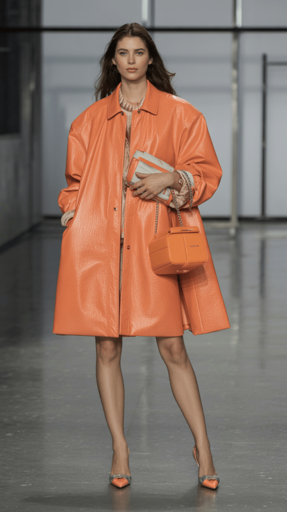
Complementary shades sit opposite each other on the color wheel — red and green, blue and orange, yellow and purple. When placed together, they create maximum contrast and energy. The secret is to let one color dominate while the other supports it.
If you wear a bright turquoise dress, pair it with coral heels or earrings; the contrast feels lively but not chaotic. A violet dress with mustard shoes or a gold clutch offers the same satisfying visual tension.
Complementary styling is perfect for moments when you want your look to feel confident and modern — evening events, parties, or fashion-forward street style.
To soften complementary looks for daytime, choose muted tones: sage with dusty rose, or sky blue with peach. The balance stays, but the mood becomes calm and wearable.
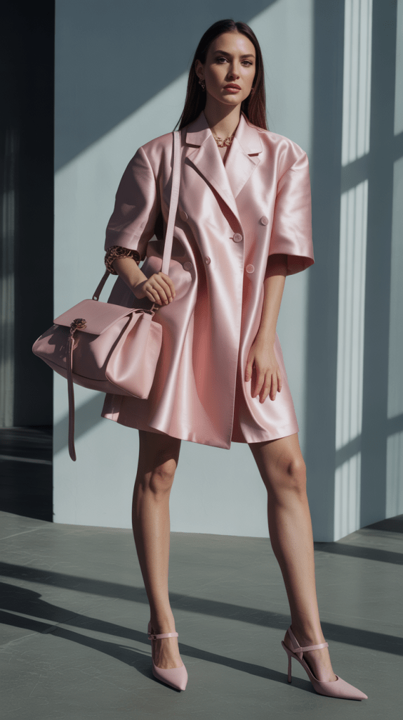
Monochrome – Power in Simplicity
Monochrome outfits use variations of the same color, playing with lightness, darkness, or material instead of different hues. A lavender dress with lilac heels and a deep plum bag feels cohesive yet rich in dimension.
This approach is timeless because it elongates the silhouette and instantly looks refined. It’s also one of the easiest ways to wear colorful fashion without risk — especially if you’re new to bright clothing.
To keep monochrome styling from feeling flat, vary fabrics and textures. Combine matte cotton with glossy satin, or smooth leather with soft chiffon. Light interacts differently with each texture, creating depth inside one color family.
Analogous Colors – Effortless Flow
Analogous combinations pair colors that sit next to each other on the wheel, like pink and coral, or blue and teal. They blend naturally because they share undertones, giving your outfit an easy, graceful look.
Think of a pastel pink dress with a peach handbag, or a mint dress with light turquoise accessories. The colors melt together, soft but expressive. This formula is ideal for spring and summer colorful outfits where you want harmony without high contrast.
To prevent an analogous outfit from looking too uniform, introduce a neutral — white sandals, a beige jacket, or silver jewelry — to create structure without breaking the flow.
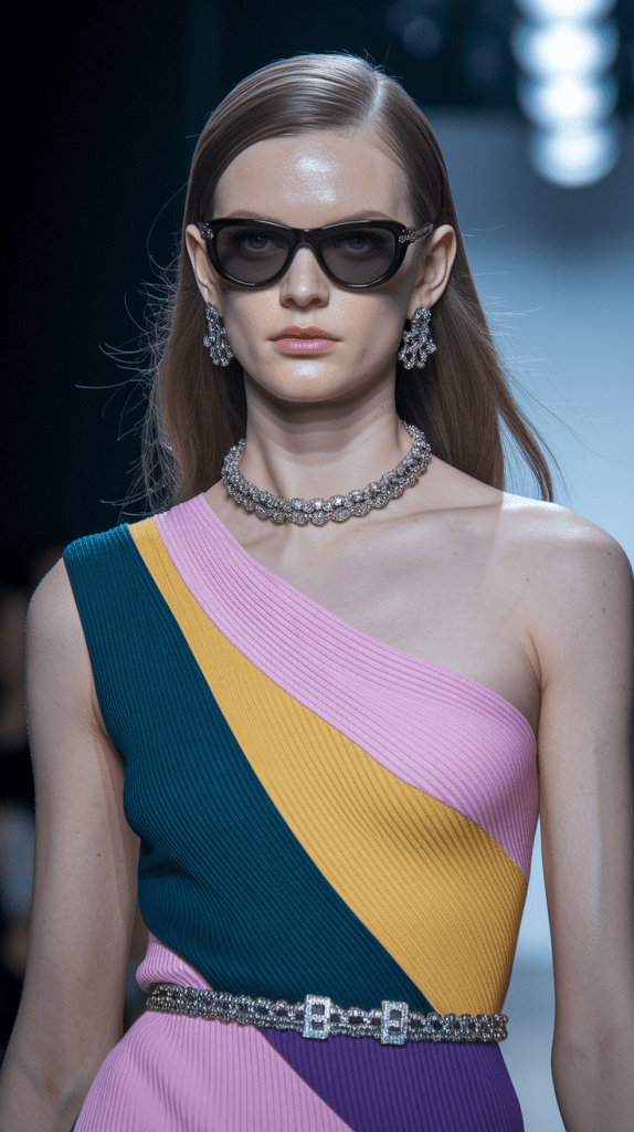
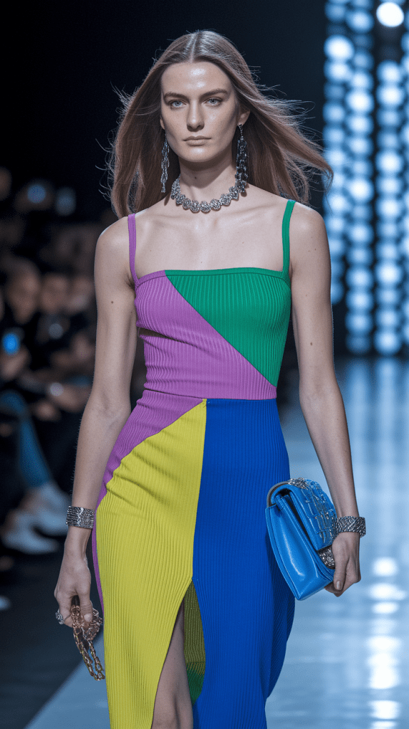
Triadic Colors – Confident and Balanced
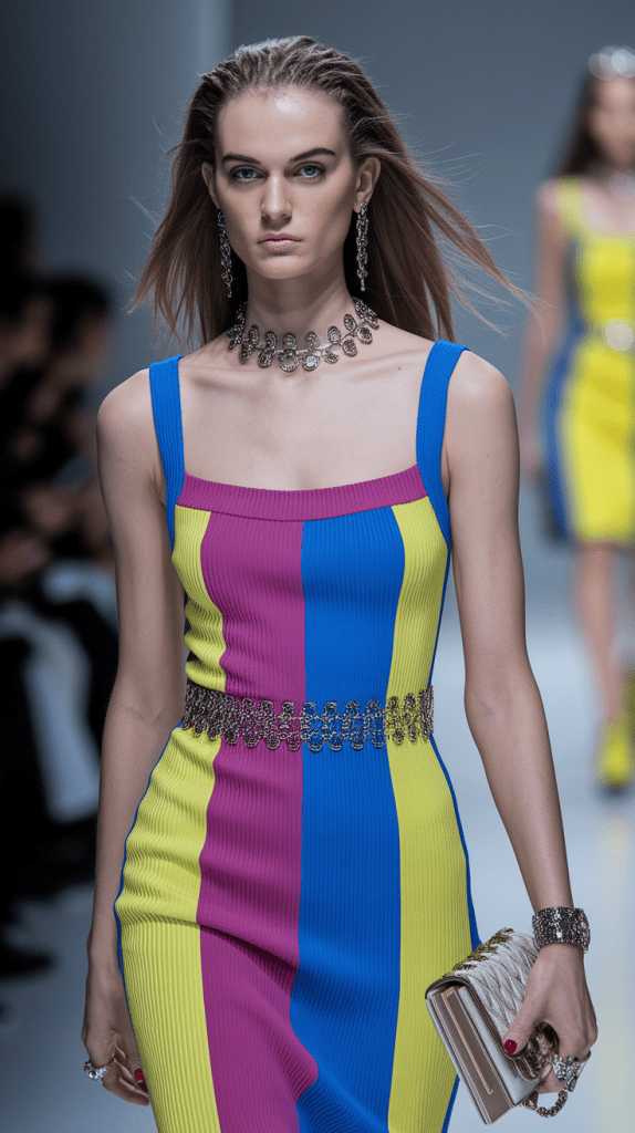
Triadic harmony uses three colors evenly spaced on the wheel — for example, red, yellow, and blue, or purple, green, and orange. The result is vivid and artistic, but still balanced because the spacing keeps the tones distinct.
If you’re wearing a bright green dress, add lavender earrings and a coral clutch. The trio feels creative, stylish, and deliberate. Triadic schemes work well for expressive personalities who love statement fashion.
The secret is moderation: let one color lead and keep the other two in smaller proportions. This keeps your outfit lively but not overwhelming.
Split-Complementary Colors – Gentle Contrast
A split-complementary palette takes one color and combines it with the two shades adjacent to its opposite. For example, pairing a red dress with teal and olive accessories. This creates softer contrast than direct opposites but still feels dynamic.
It’s an elegant choice for women who enjoy color but prefer sophistication over boldness. Try a royal blue dress with coral earrings and blush shoes — lively, but easy on the eyes.
Neutral Anchors – The Universal Safety Net
Every successful colorful outfit includes at least one neutral element. White, black, beige, ivory, and gray act as visual pauses that help the colors breathe. They’re the foundation that keeps color combinations from feeling too busy.
If you love experimenting with complementary or triadic schemes, start by pairing them with neutral pieces. A red dress with beige sandals or a mint outfit with a white blazer will always look intentional.
Neutrals also allow you to wear the same colorful pieces in multiple ways. By changing the neutral companion — switching black heels for tan flats — you can completely shift the tone of the outfit without replacing the dress itself.
Metallics – The Hidden Harmonizers
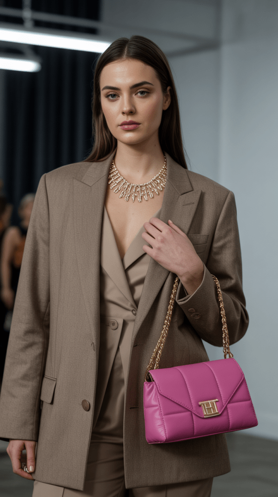
Gold, silver, and rose gold aren’t just accessories; they’re neutral-adjacent tones that bridge color gaps. Gold enhances warm colors like red, orange, and coral. Silver complements cool hues like blue, emerald, and lilac. Rose gold works beautifully with pinks, creams, and nude shades.
Adding metallics to your outfit provides subtle reflection and polish, making any colorful dress feel elevated. Even a simple pair of metallic sandals or a clutch can tie your look together when you’re uncertain about color balance.
The Everyday Shortcut
When in doubt, use this quick formula:
- One dominant color (the dress)
- One neutral anchor (shoes, bag, or outer layer)
- One tonal accent (accessories or makeup)
It works for every season, every mood, and every wardrobe.
Perfect color harmony isn’t about memorizing charts — it’s about understanding rhythm. Once you practice these formulas, you’ll instinctively know which shades belong together. Each outfit will start to feel smoother, more natural, and undeniably stylish.
Seasonal Outfit Inspiration
Colorful fashion changes with the seasons, but harmony stays the same. Every time of year has its own palette — from airy spring tones to deep winter hues. Knowing how to adjust your colorful dresses and outfits through the seasons keeps your wardrobe fresh and stylish all year long.
Spring – Light and Romantic
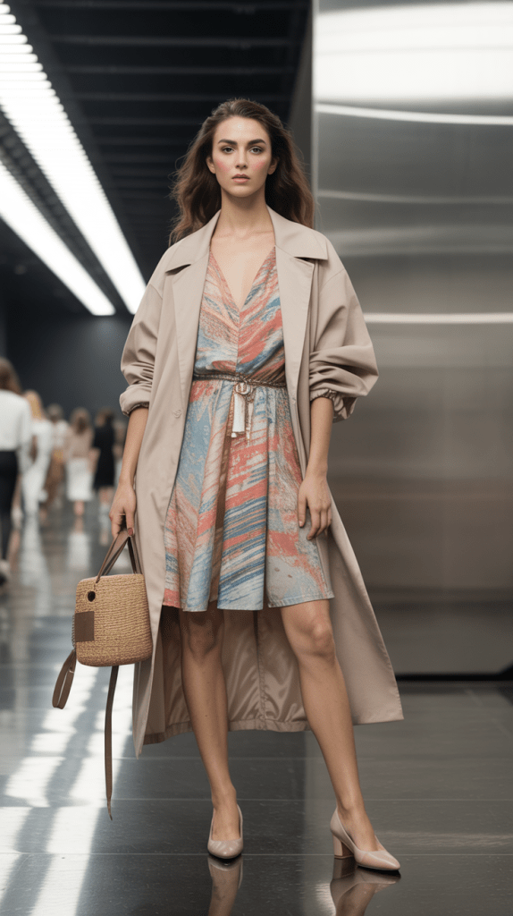
Spring is the season of renewal and pastel tones. Soft pink, mint, lilac, and butter yellow dominate this palette. Choose light fabrics like cotton or chiffon, and pair colorful dresses with beige shoes and gold jewelry for warmth. Add a white cardigan or light trench for cool mornings — gentle layers that match the season’s softness.
Summer – Bold and Playful
Summer is the time to embrace brightness. Coral, turquoise, tangerine, and hot pink look radiant under sunlight. Flowing dresses, linen fabrics, and straw textures make every outfit feel carefree. Balance vivid colors with neutral accessories — white sandals, natural handbags, and delicate gold details.
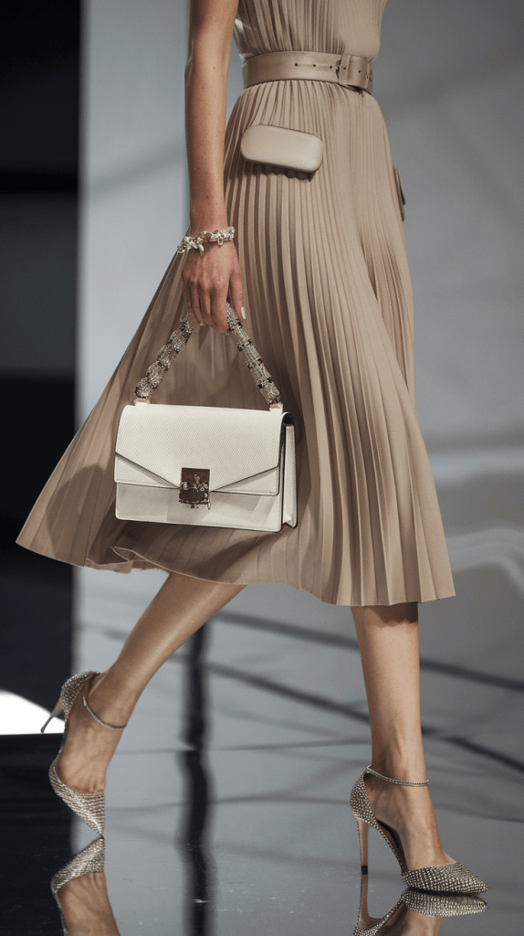
Autumn – Warm and Refined
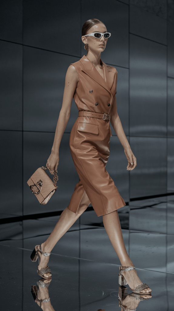
Autumn tones are deeper and richer. Think rust, mustard, olive, and burgundy. Choose colorful dresses in slightly heavier fabrics like satin or knit. Combine them with tan boots, brown belts, or camel coats to bring out the warmth. Gold jewelry and leather textures complete the cozy, elegant mood.
Winter – Strong and Sophisticated
Winter fashion celebrates contrast. Jewel tones like emerald, sapphire, and plum look striking against neutrals. Pair a bold dress with black or gray outerwear for balance. Silver or pearl accessories add a crisp, modern touch. Focus on structure — fitted silhouettes, heavier fabrics, and clean lines bring depth to winter’s colorful style.
Seasons may change, but color confidence doesn’t. When you learn how to adapt tones, fabrics, and textures to the weather, your colorful outfits always stay fresh, polished, and perfectly in tune with the moment.
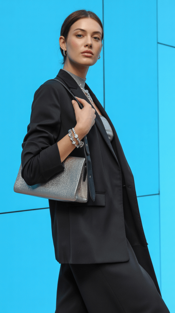
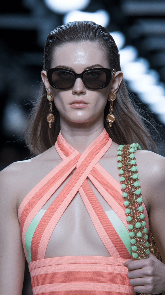
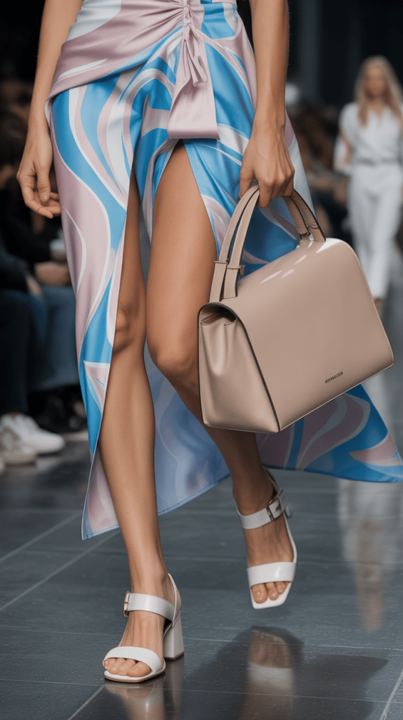
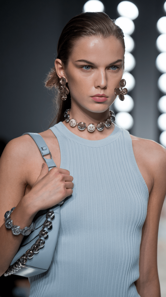
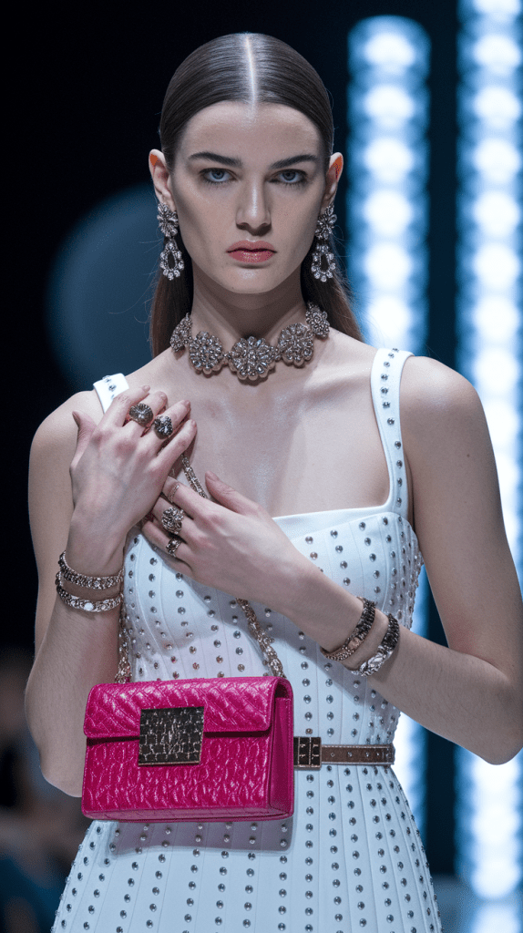
Accessorizing Colorful Dresses
Accessories are the bridge between style and personality. The right shoes, bag, or jewelry can turn a colorful dress from simple to unforgettable. The secret is knowing how to balance attention — if the dress is bold, keep accessories subtle; if the dress is soft, let the details shine.
Shoes
Shoes define the outfit’s direction.
- Neutral shoes (nude, beige, white) balance bright colors.
- Metallics (gold, silver) add polish to formal looks.
- Color-matching shoes create elegant monochrome harmony.
Avoid heavy contrasts unless they’re part of a deliberate statement.
RELATED POSTS:
Nude Heels – a must-have in your wardrobe
Bags
Your handbag should support the outfit, not compete with it.
- Use neutral or transparent tones for multicolored dresses.
- Try bold mini bags when your dress is minimal.
- For daywear, woven or leather textures work beautifully with colorful outfits.
RELATED POST: Fall/Winter 2025–2026 Designer Bag Trends
Jewelry
Jewelry connects everything.
- Gold enhances warm tones like red, coral, and yellow.
- Silver suits cool tones like blue, green, and lilac.
- Pearls and crystals add softness to pastel dresses.
Final Touches
Belts, scarves, and sunglasses can refine a look instantly. The rule is simple: one statement piece at a time. Let your accessories echo your dress — not overpower it.
When you accessorize with intention, your colorful outfit feels balanced, modern, and unmistakably yours.
Common Color Mistakes and How to Fix Them
Even the most stylish outfits can lose balance when color harmony is overlooked. The good news? These mistakes are easy to spot — and even easier to fix.
Too Many Competing Colors
Wearing more than three strong shades can make an outfit feel chaotic.
Fix: Choose one main color, one supporting tone, and a neutral accent. Let your colorful dress lead.
Ignoring Undertones
A dress that clashes with your skin tone can dull your appearance.
Fix: Identify if your undertone is warm or cool and pick colors that enhance it. Warm tones glow in coral, gold, and mustard; cool tones shine in lilac, navy, and silver.
No Neutral Balance
Without neutral anchors, bright outfits lose structure.
Fix: Add beige, white, or gray accessories to calm the look and make colors stand out.
Over-Accessorizing
Too many bold pieces compete for attention.
Fix: Limit to one statement item — earrings, bag, or shoes. Simplicity creates elegance.
Ignoring Fabric and Light
Some colors look different depending on material or lighting.
Fix: Try your dress in daylight before styling. Matte fabrics soften bright hues; shiny ones intensify them.
Perfect color styling is less about rules and more about awareness. Once you learn balance, every colorful outfit feels natural and beautifully put together.
Style Personalities and Color Stories
Every woman expresses color differently. Your favorite shades often reveal your fashion personality — how you want to feel, move, and be seen. Understanding your color story helps you dress with more confidence and authenticity.
The Minimalist
Loves simplicity and calm. Prefers neutral or monochrome looks with small bursts of color — a beige dress with coral lipstick or pastel accessories.
The Romantic
Drawn to soft, feminine hues like blush, lavender, and cream. Dresses often flow with light fabrics and floral tones, creating a graceful, dreamy look.
The Bold Trendsetter
Loves contrast and saturation — electric blue, magenta, orange. This style personality thrives on attention and knows how to turn color into confidence.
The Natural
Prefers earthy tones and comfortable fabrics. Think olive, rust, mustard, and tan — effortless colorful fashion that feels grounded and timeless.
The Elegant Classic
Favors balanced, refined shades like navy, white, black, and deep red. Color is used strategically — always polished, never loud.
Whatever your style, color is your signature. When it reflects your mood and personality, your outfit becomes more than fashion — it becomes self-expression.
FAQ – Colorful Dress & Styling Harmony
How do I know which colors suit me best?
Start with your undertone. Warm skin looks radiant in coral, mustard, and earthy tones, while cool undertones glow in lilac, mint, or navy. If both feel flattering, you likely have a neutral tone and can mix from both palettes.
How many colors should I wear in one outfit?
Follow the Rule of Three: one dominant color (usually the dress), one complementary or supporting tone, and one neutral accent. This balance keeps every colorful outfit polished and harmonious.
What color accessories go with a bright dress?
Neutral tones like beige, tan, white, or metallics always work. Gold suits warm shades; silver flatters cool ones. If your dress has multiple colors, match accessories to one of them for cohesion.
Can I wear prints with colorful dresses?
Yes — but keep scale and tone in mind. Pair a multicolored dress with simple, solid accessories. If your dress is solid, a printed bag or shoes can add visual interest without overwhelming your look.
How do I style a colorful dress for formal events?
Choose richer fabrics like satin or silk, keep accessories minimal, and balance bright colors with metallic or nude accents. The goal is elegance — let the color speak softly, not loudly.
Are there universal colors that flatter everyone?
Yes. Soft teal, dusty rose, navy, and warm beige suit almost every complexion. These shades make great base tones when building a colorful fashion wardrobe.
What makeup works best with colorful outfits?
Use makeup to support the color story, not compete with it. Neutral eyes, soft blush, and lips that echo your outfit’s undertone create harmony without distraction.
How can I make a bold color look subtle?
Tone it down with texture and balance. Pair a bright dress with matte fabrics, neutral accessories, or minimal patterns. Repetition of the same hue in small details helps soften its intensity.
Can I wear different bright colors together?
Absolutely — as long as they share undertones. For example, coral and mustard (both warm) or turquoise and lavender (both cool). If in doubt, add a neutral layer between them.
What is the biggest mistake when wearing color?
Forgetting balance. Too many contrasting hues can break harmony. Always give the eye a place to rest — one dominant color, one supporting shade, and space for calm.
How to Look Rich and Classy: 10 Style Rules That Always Work
(Without Overspending): The Modern Quiet-Luxury Guide Key Takeaways Avoid the biggest giveaways: poor fit, cheap shine, trend-stacking, loud branding. Looking rich and classy is mostly fit, fabric, grooming,…
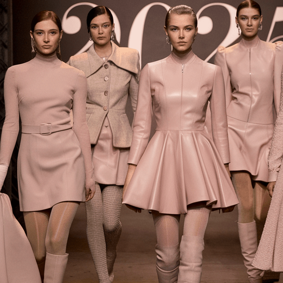
2026 Spring/Summer Fashion Color Guide
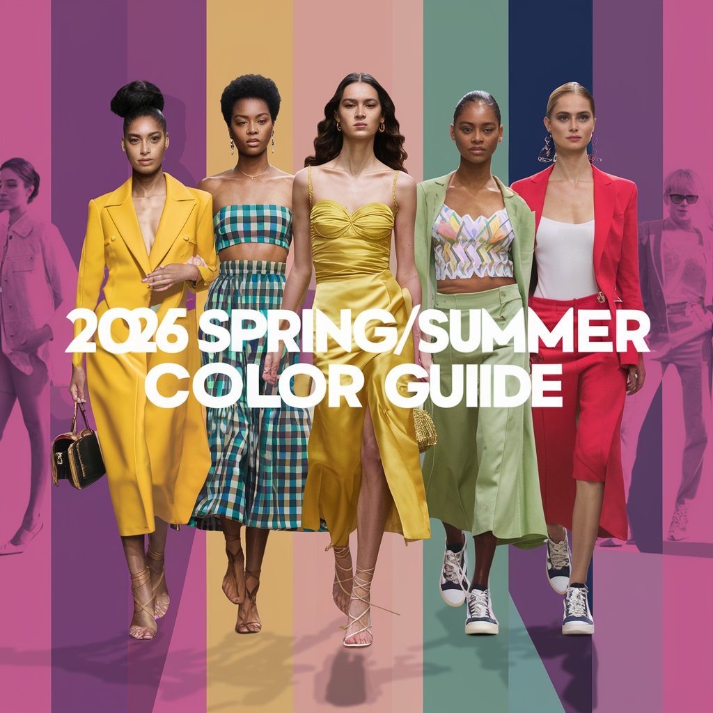
The 12 Fashion Shades That Will Dominate Outfits Everywhere Spring/Summer 2026 doesn’t arrive loudly. It slides in like sunlight on clean sheets—soft, bright, effortless. Fashion gets…
2026 Fashion Trend Colors
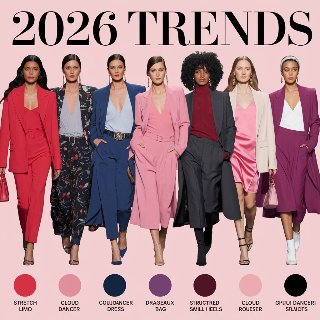
The Pantone-Inspired Palette Guide You’ll Actually Use Air feels different in 2026. Softer. Cleaner. Less noise, more intention. The year’s color direction isn’t screaming for attention—it’s…
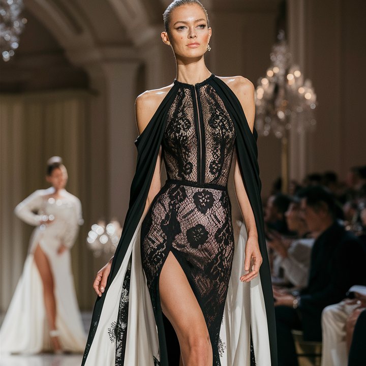
15 Best Lace Bridesmaid Dresses That Redefine Modern Weddings
Why Lace Is the Strongest Bridesmaid Trend This Year Lace sits perfectly at the intersection of tradition and modern fashion. It carries craftsmanship, detail, and heritage…
15 Extravagant Urban Outfits for City Girls
Extravagant Urban Outfits for City Girls Who Refuse to Blend In Casual Chic, But Make It Dangerous Casual chic used to mean safe.Neutral. Predictable. Easy to…
15 Casual Chic Women’s Looks
Effortless Style That Works in Real Life The New Definition of Everyday Chic Casual chic is no longer a trend — it’s a response. A response to busy…
12 Black Blazer Outfit Ideas
12 Black Blazer Outfit Ideas That Feel Expensive, Unexpected, and Effortlessly Powerful The black blazer is one of those rare wardrobe pieces that never disappears. Trends…
23 Best Wedding Guest Outfits for Spring–Summer
Spring–Summer Wedding Guest Style Guide: Modern, fashion-forward outfit ideas for women who want to stand out without stealing the spotlight Choosing a wedding guest outfit for…