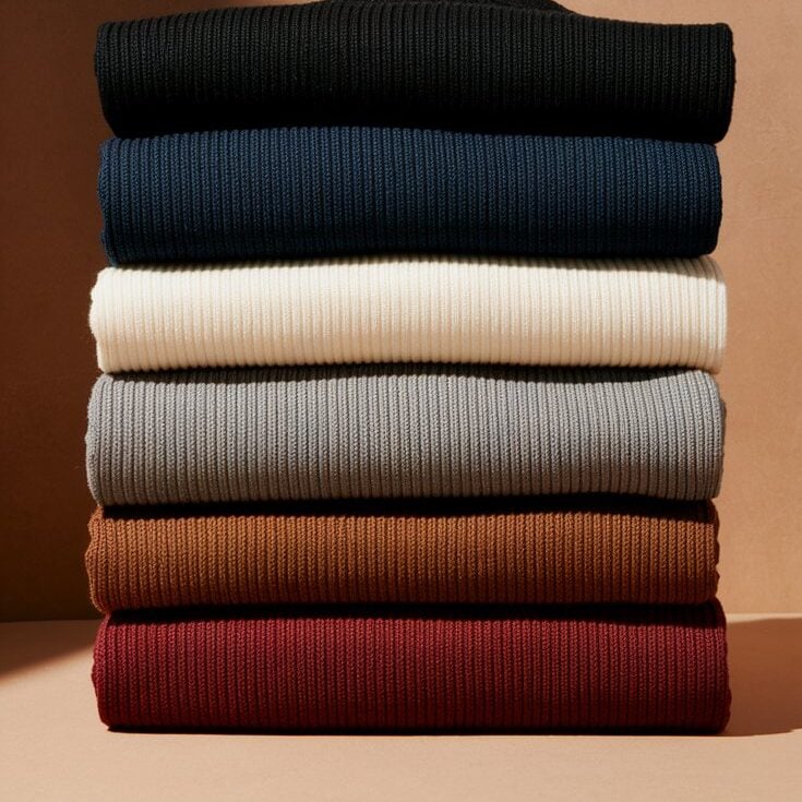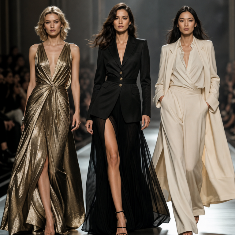
Fall/Winter Fashion Color Guide
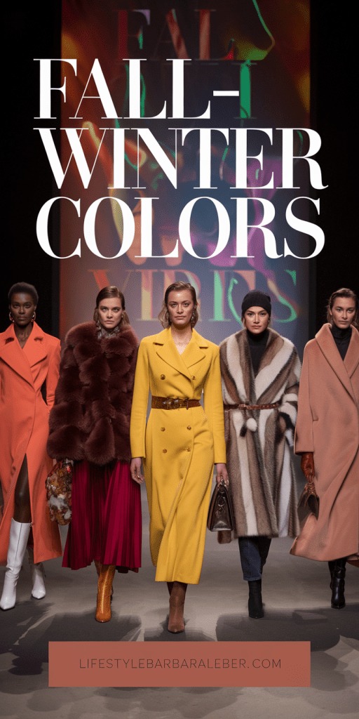
A Full-Color Guide to the Season of Reimagined Elegance
As the golden hues of autumn leaves give way to the hushed elegance of winter snow, something else is shifting too—our relationship with color. This season, the Pantone Color Institute unveils a palette that doesn’t merely reflect seasonal change, but transforms it. Introducing the Autumn/Winter Color Trend Report from New York Fashion Week: a curated collection of rich tones, quiet vibrancy, and poetic nuance.
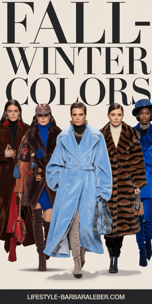
Gone are the days of color being loud for attention’s sake. This year, color speaks softly—but with strength. It wraps around you like a favorite coat. It lingers like a scent. It invites you to reconnect with your emotional core, your personal style, and your evolving identity.
This post contains affiliate links, which I may earn a small commission from (with no extra cost to you). Thank you for your support!
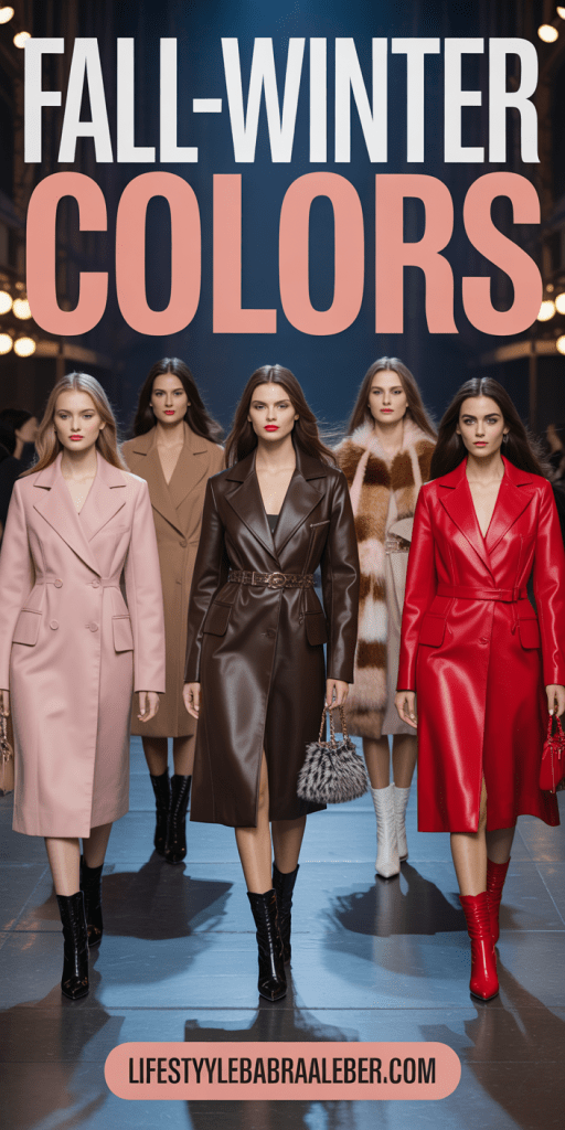
These aren’t colors that tell you who to be. They let you decide.
| Image | Product | Price |
|
Our Pick
 |
| Image | Product | Price |
|
Our Pick
 |
Let’s explore every single shade, the emotions behind them, the fashion possibilities, and how these colors can be used in your wardrobe, your visual branding, or your creative direction. If you’ve been craving a color guide that’s both grounded and inspiring—this is it.
🌟 The Essence of the Season: Quiet Luxury, Poetic Expression
Leatrice Eiseman, Executive Director of the Pantone Color Institute, described this season’s palette as one that offers “a reimagined vision of traditional seasonal colorings.” At its core, the Autumn/Winter palette invites us to slow down. To embrace the beauty in restraint. And to find warmth and meaning in every thread, brushstroke, and hue.
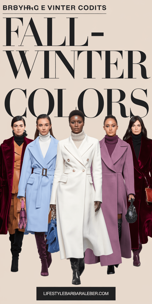
This season’s colors are:
- Soft, but impactful
- Romantic, but grounded
- Familiar, but reimagined
| Image | Product | Price |
|
Our Pick
 |
| Image | Product | Price |
|
Our Pick
 |
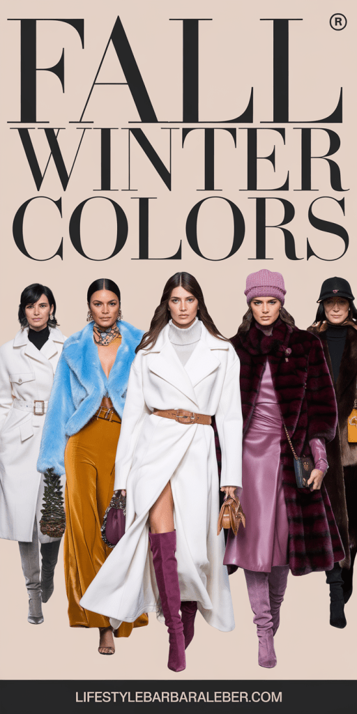
It’s the kind of color story that makes you pause—and feel.
| Image | Product | Price |
|
Our Pick
 |
| Image | Product | Price |
|
Our Pick
 |
🎨 Meet the Colors: The Top 10 Pantone Shades
Each of the ten trend-setting colors tells a story. Some whisper nostalgia, others hum with optimism, and a few smolder with unapologetic drama. Here’s a detailed look at each hue, how it feels, how to wear it, and how to use it in your creative world.
🍋 1. Lemon Grass
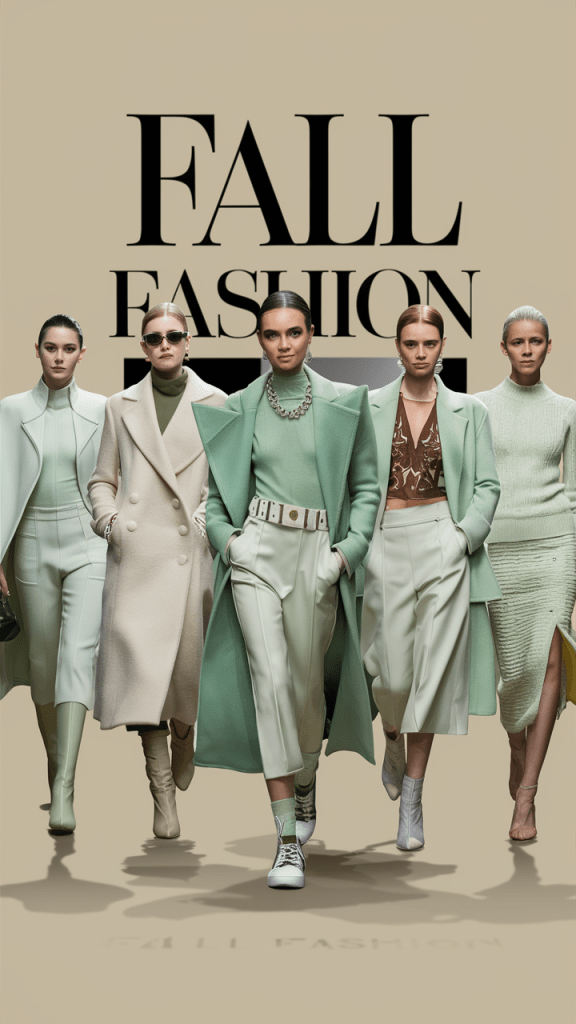
A fresh, citrus-tinged green that feels like a breath of early spring in the middle of winter. Lemon Grass is light, herbal, slightly floral—and utterly unexpected in colder months.
- Mood: optimistic, clean, botanical
- Fashion Styling: trench coats, silk scarves, quilted outerwear
- Color Pairing: Beautiful with earthy neutrals like Bronze Brown or with dusky pinks for a feminine balance
- Content Use: Great for health & wellness brands, nature-inspired aesthetics, or modern minimalist visuals
🍈 2. Brandied Melon
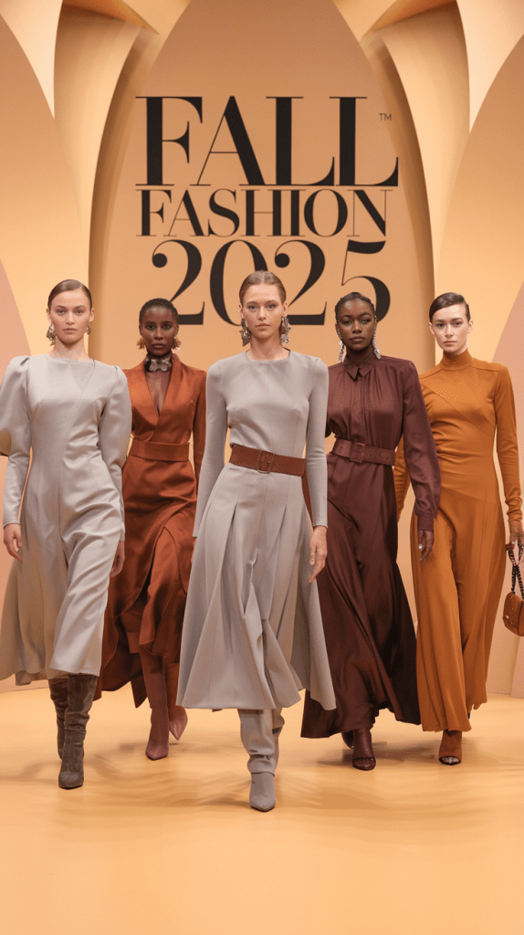
Imagine a cross between spiced apricot and burnt orange. Brandied Melon brings warmth, nostalgia, and a comforting sense of home. It’s a hug in color form.
- Mood: cozy, sunlit, grounded
- Fashion Styling: oversized sweaters, knit dresses, puffer vests
- Color Pairing: Try it with Lyons Blue for contrast or Hot Chocolate for harmony
- Content Use: Use this in autumnal content, recipe visuals, or lifestyle reels to create warmth and emotion
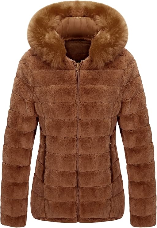
🌊 3. Lyons Blue
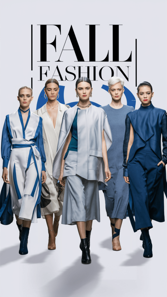
Deep. Moody. Regal. Lyons Blue is not your average navy—it’s more opulent, more saturated, more literary. Like ink on a handwritten letter or velvet drapes in a historic theater.
- Mood: elegant, introspective, powerful
- Fashion Styling: long coats, wide-leg trousers, monochrome layering
- Color Pairing: Contrasts perfectly with Lemon Grass, Damson, or Primrose Pink
- Content Use: A fantastic anchor tone in branding, graphic design, and product photography
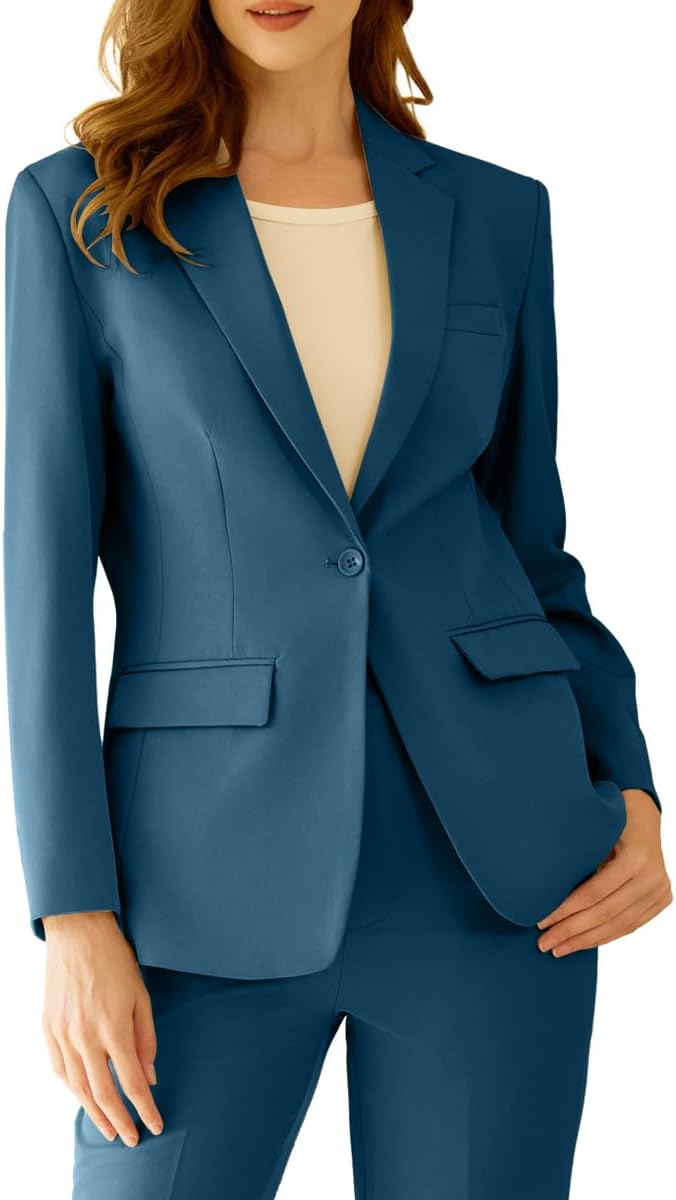
🍷 4. Damson
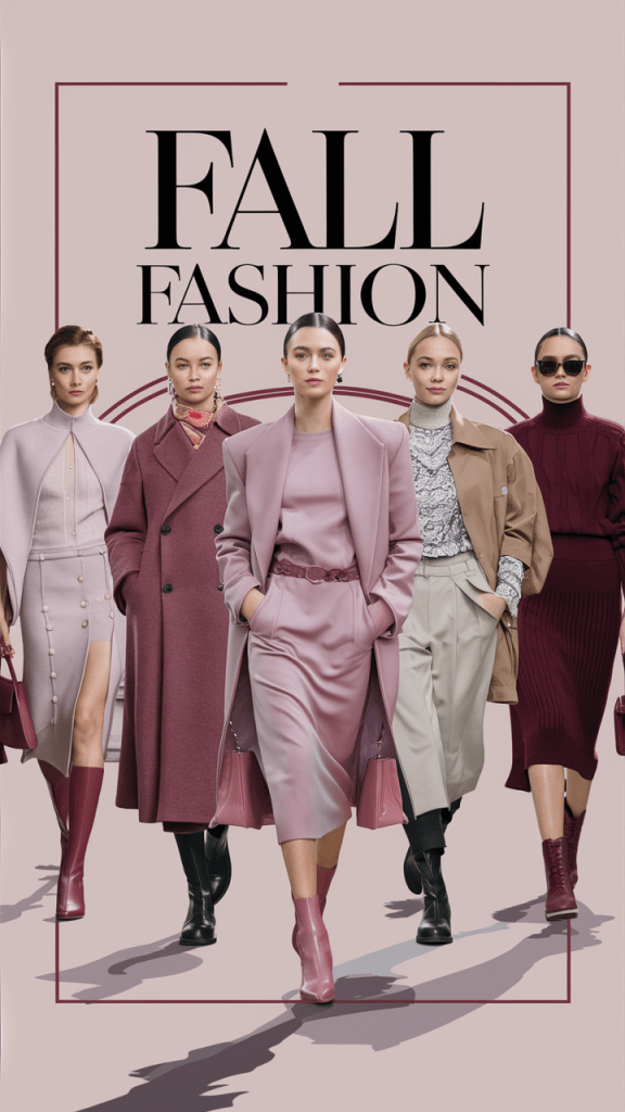
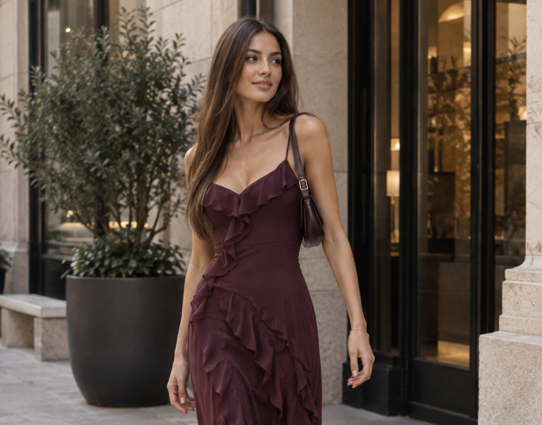
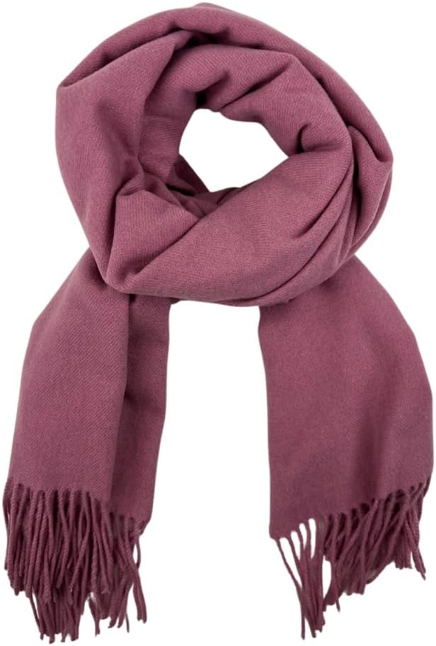
Damson is a rich plum red that feels bold without being brash. It’s dramatic and romantic, yet totally wearable. Think candlelight, cabernet, and midnight secrets.
- Mood: passion, seduction, mystery
- Fashion Styling: velvet slip dresses, structured tailoring, fall florals
- Color Pairing: Use it with metallics, off-whites, or gold for drama
- Content Use: Perfect for luxury marketing, perfume campaigns, or moody winter content
🌸 5. Primrose Pink
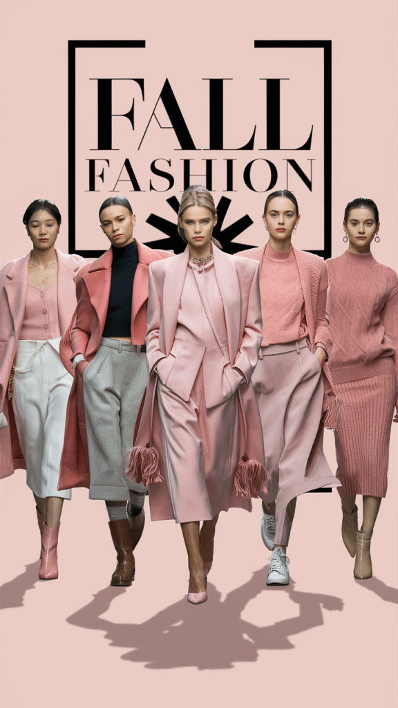
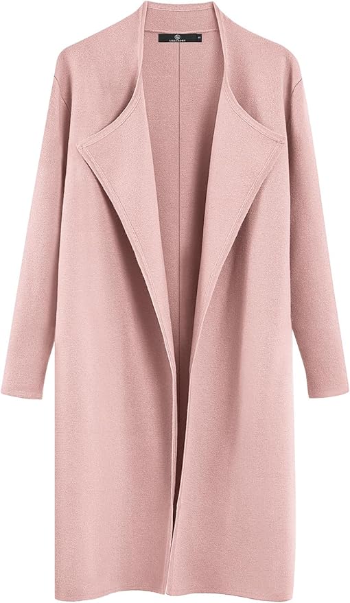
A barely-there blush that adds softness and approachability to any outfit or brand. Primrose Pink is gentle, but never bland. It’s elegance distilled into pastel.
- Mood: purity, grace, lightness
- Fashion Styling: turtlenecks, silk blouses, tonal loungewear
- Color Pairing: Contrasts beautifully with Lyons Blue or Hot Chocolate
- Content Use: Use this shade in feminine aesthetics, wellness brands, or self-care themed layouts
❤️🔥 6. Winterberry
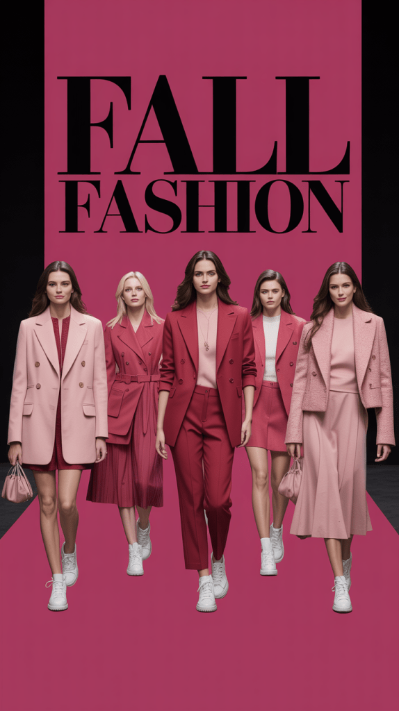
This spicy red feels like the fire inside a snow-covered cabin. It’s warm, energetic, and inviting—without being overpowering. The ideal red for a confident soul.
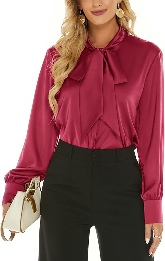
- Mood: energy, passion, vibrancy
- Fashion Styling: turtlenecks, lipstick, winter coats, accessories
- Color Pairing: Try it with neutrals like Bright White or French Roast
- Content Use: Holiday campaigns, Valentine’s visuals, or strong CTA buttons
🍫 7. Hot Chocolate
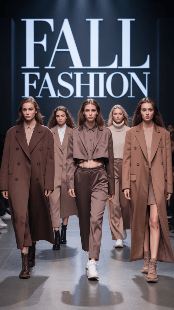
Rich, delicious, and comforting. Hot Chocolate is a deeper alternative to traditional brown, with more soul and softness. It’s the color of quiet confidence.
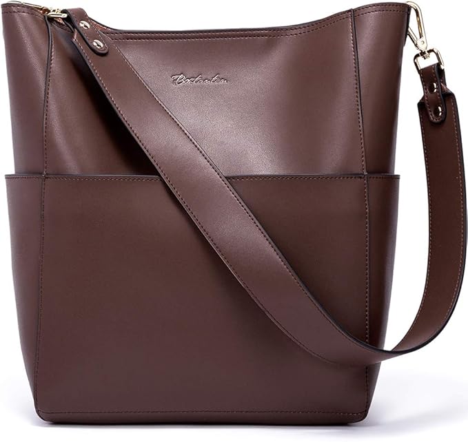
- Mood: coziness, tradition, comfort
- Fashion Styling: vegan leather trousers, knitwear, shearling coats
- Color Pairing: Works beautifully with Brandied Melon or Primrose Pink
- Content Use: Ideal background for product photography, coffee culture content, and warm brand storytelling
🌶 8. Chili Oil
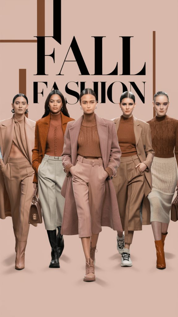
Earthy, edgy, and spiced. Chili Oil is a deep red-brown with depth and bite. It gives character to any palette and leans into natural textures and bold choices.
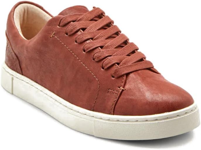
- Mood: adventurous, rustic, grounded
- Fashion Styling: outerwear, corduroy, statement boots
- Color Pairing: Contrasts well with greens or soft neutrals
- Content Use: Great for natural beauty brands, cooking content, or vintage-themed visuals
🎉 9. Poppy Red
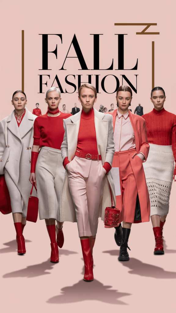
An unapologetically vibrant red that screams celebration. Poppy Red is festive and alive—it’s the color equivalent of throwing your arms in the air.
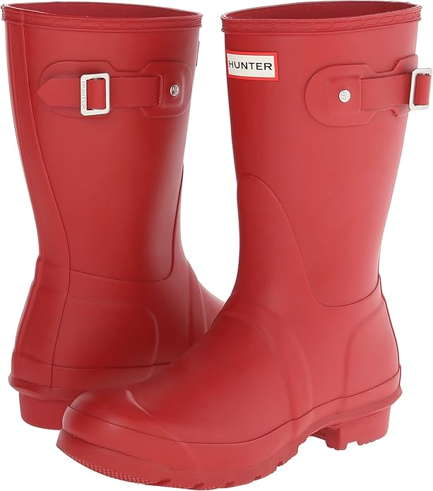
- Mood: exuberance, confidence, vitality
- Fashion Styling: gowns, lipstick, accessories, bold suits
- Color Pairing: Use as a pop alongside muted colors or pair with Winterberry for tonal play
- Content Use: Social media calls-to-action, sales events, Valentine’s or New Year content
🪵 10. Bronze Brown
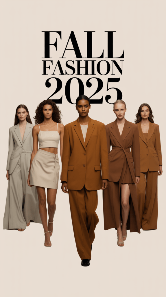
This golden-toned brown feels ancient, grounded, and elegant all at once. Bronze Brown is the definition of quiet luxury—a tone that exudes timelessness.
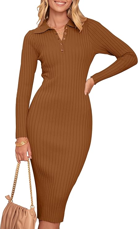
- Mood: stability, heritage, nature
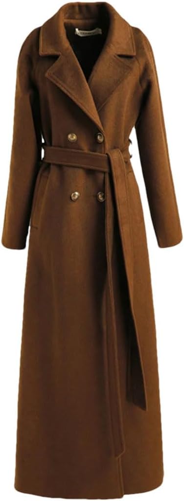
- Fashion Styling: structured coats, boots, leather handbags
- Color Pairing: Combine with Lemon Grass or French Roast for organic warmth
- Content Use: Luxury branding, neutral Pinterest boards, or architectural visuals
🕊 The Supporting Cast: 5 Seasonless Neutrals
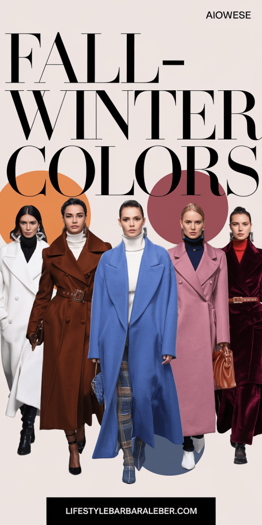
These neutrals are meant to carry the bold tones above through every season—and they’re anything but boring. They create a modern canvas for rich pairings and subtle statements.
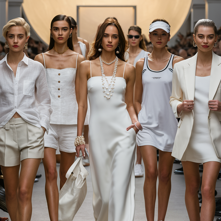
- Bright White – Crisp, clean, modern
- French Roast – Dark, smooth brown with espresso undertones
- Vapor Blue – Soft, misty sky blue
- Crown Blue – Refined, almost-navy
- Mauve Wine – Romantic, dusty rose-burgundy hybrid
| Image | Product | Price |
|
Our Pick
 |
| Image | Product | Price |
|
Our Pick
 |
These five act as the glue for the whole palette, allowing you to mix-and-match with elegance and ease.
👗 Color Pairing Ideas: From Runway to Real Life
Here are a few combinations that stand out for their emotional and visual impact:
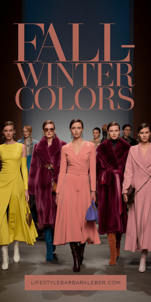
- Lemon Grass + Bronze Brown → Natural & modern
- Lyons Blue + Primrose Pink → Sophisticated contrast
- Winterberry + Bright White → Bold yet clean
- Damson + Mauve Wine → Sensual & romantic
- Chili Oil + Brandied Melon → Autumnal perfection
| Image | Product | Price |
|
Our Pick
 |
| Image | Product | Price |
|
Our Pick
 |
Use these in your outfits, Instagram carousels, product mockups, or Pinterest boards to keep your aesthetic aligned with AW25–26 trends.
🛍 How to Wear the Palette
- For Minimalists: Stick to neutrals like Crown Blue and French Roast, adding subtle pops of Primrose Pink or Lemon Grass.
- For Maximalists: Layer Poppy Red with Lyons Blue and Chili Oil for a bold winter statement.
- For Capsule Wardrobes: Build around Hot Chocolate, Bronze Brown, and Bright White, then switch accents seasonally.
- For Vintage Lovers: Lean into Damson, Mauve Wine, and Brandied Melon.
| Image | Product | Price |
|
Our Pick
 |
| Image | Product | Price |
|
Our Pick
 |
📸 Content Creator Tips: Using the Palette Online
Whether you’re designing your brand, planning a social feed, or shooting editorial content, this color story offers unlimited potential.
- Reels Backgrounds: Use Lyons Blue or Hot Chocolate for depth
- Highlight Covers: Choose Lemon Grass or Poppy Red for attention
- Website Design: Bronze Brown as a grounding color with Vapor Blue as a contrast
- Pinterest Boards: Build by mood—e.g., “Quiet Luxury” (French Roast, Damson, Mauve Wine)
🧠 Emotional Color Psychology: Why This Palette Works
These hues don’t just look good—they feel good:
- Warm browns and melons soothe and ground
- Vibrant reds and pinks energize and uplift
- Moody blues and purples add intellectual depth
- Fresh greens and crisp whites inspire hope and renewal
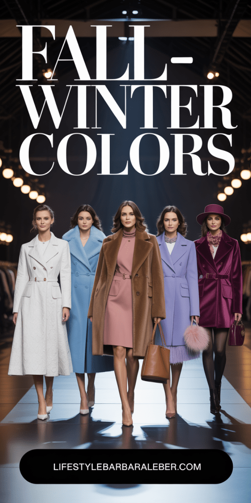
The overall palette creates a sensory balance—something the modern consumer craves.
🗓 When to Use Which Colors
| Month | Focus Hues | Theme |
|---|---|---|
| October | Brandied Melon + Chili Oil | Autumn harvest, coziness |
| November | Bronze Brown + Hot Chocolate | Grounded earthiness |
| December | Winterberry + Poppy Red | Holiday festivity |
| January | Primrose Pink + Bright White | Fresh start, calm renewal |
| February | Damson + Mauve Wine | Romance, depth, introspection |
| March | Lemon Grass + Lyons Blue | Nature, growth, modern expression |
🧵 A Season of Color, Character & Calm
Pantone’s Autumn/Winter 2025–2026 palette is not loud. It’s not flashy. But it is powerful.
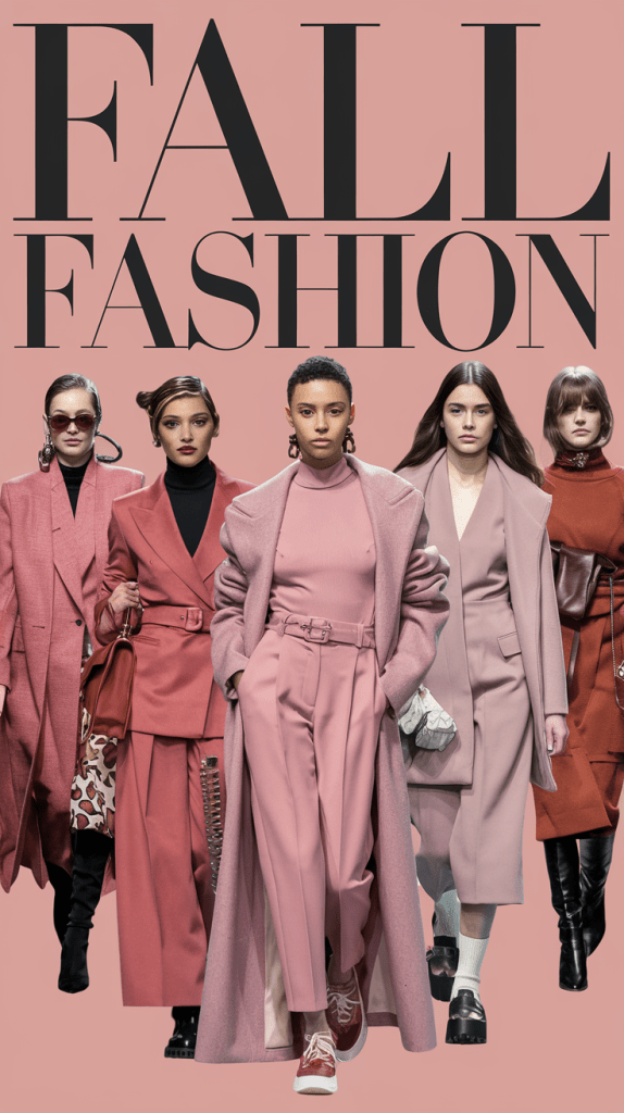
It’s a palette for the woman who’s grown into herself. For the brand that wants to connect instead of convert. For the creator who wants to tell stories that linger.
This is not a season of reinvention. It’s a season of reimagination. And color is our most beautiful tool to do just that.
About the Author
Barbara Leber
Fashion Designer | Founder of Lifestyle Barbara Leber
With more than 20 years of experience in fashion design, I share practical styling advice that goes beyond trends. My goal is to help women build elegant, wearable wardrobes and make confident style choices through timeless, refined fashion.
Areas of Expertise
Fashion Design · Capsule Wardrobes · Color Coordination · Seasonal Styling · Luxury Fashion · Editorial Styling
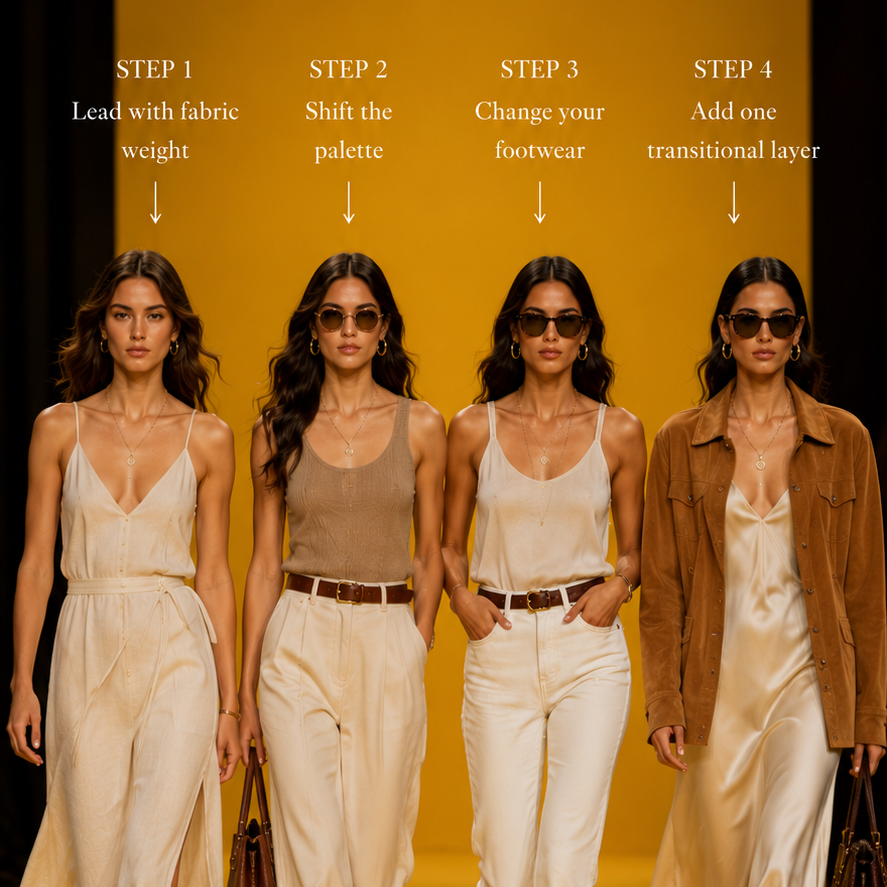
How to Transition Your Summer Wardrobe Into Early Fall 2026: A Step-by-Step Style Guide
Transitioning a summer wardrobe into early fall means layering and reweighting what you own rather than replacing it. Lead with fabric weight instead of the…
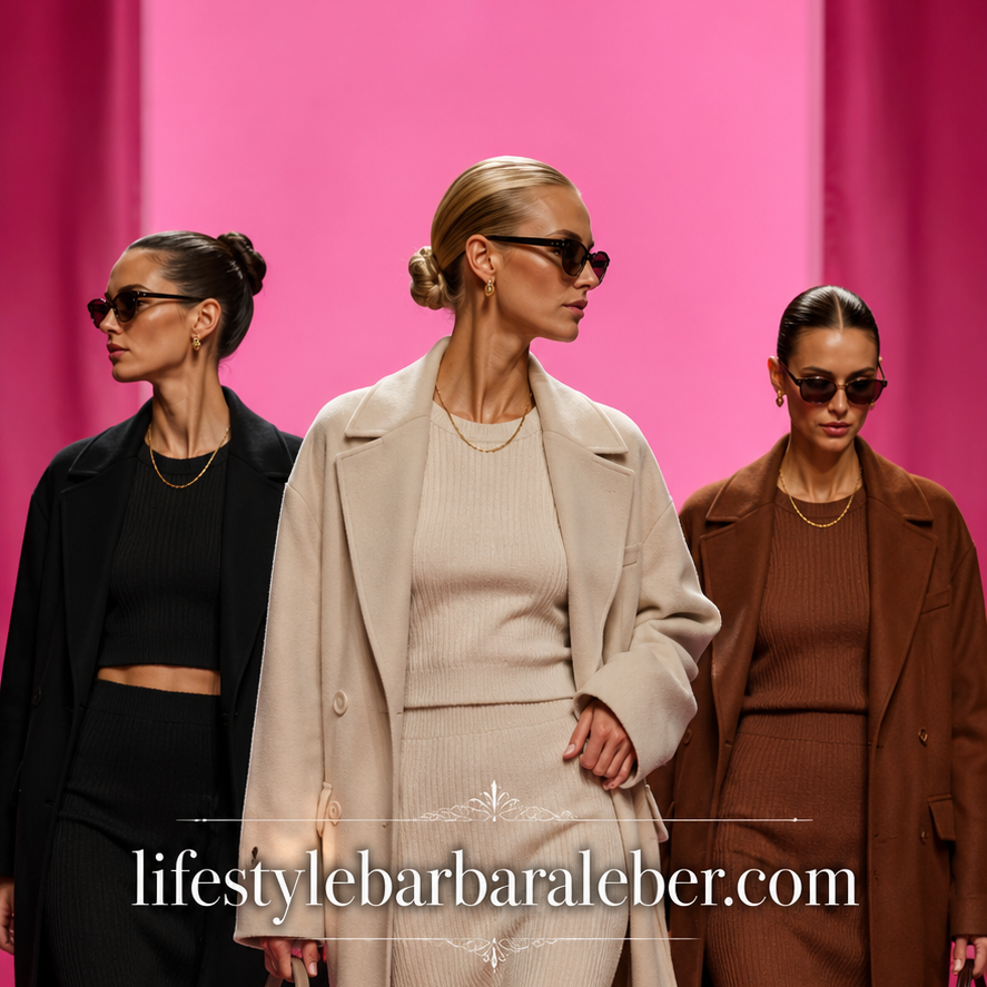
15 Early Fall Outfits for 2026: Transitional Looks for the In-Between Weather
Early fall outfits center on transitional layering: lightweight knits, a trench or suede jacket, and breathable fabrics in warm, tonal colors. The goal is dressing…
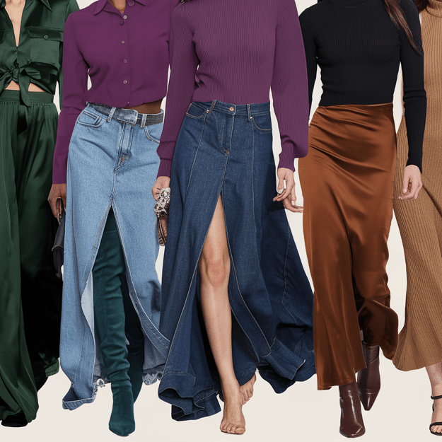
Stylish Fall Skirt Trends That Make Cold-Weather Outfits Feel Feminine
🍂 What Are the Most Stylish Skirt Trends? Fall fashion is a dreamland of cozy textures, layered looks, and rich tones — and if there’s one…
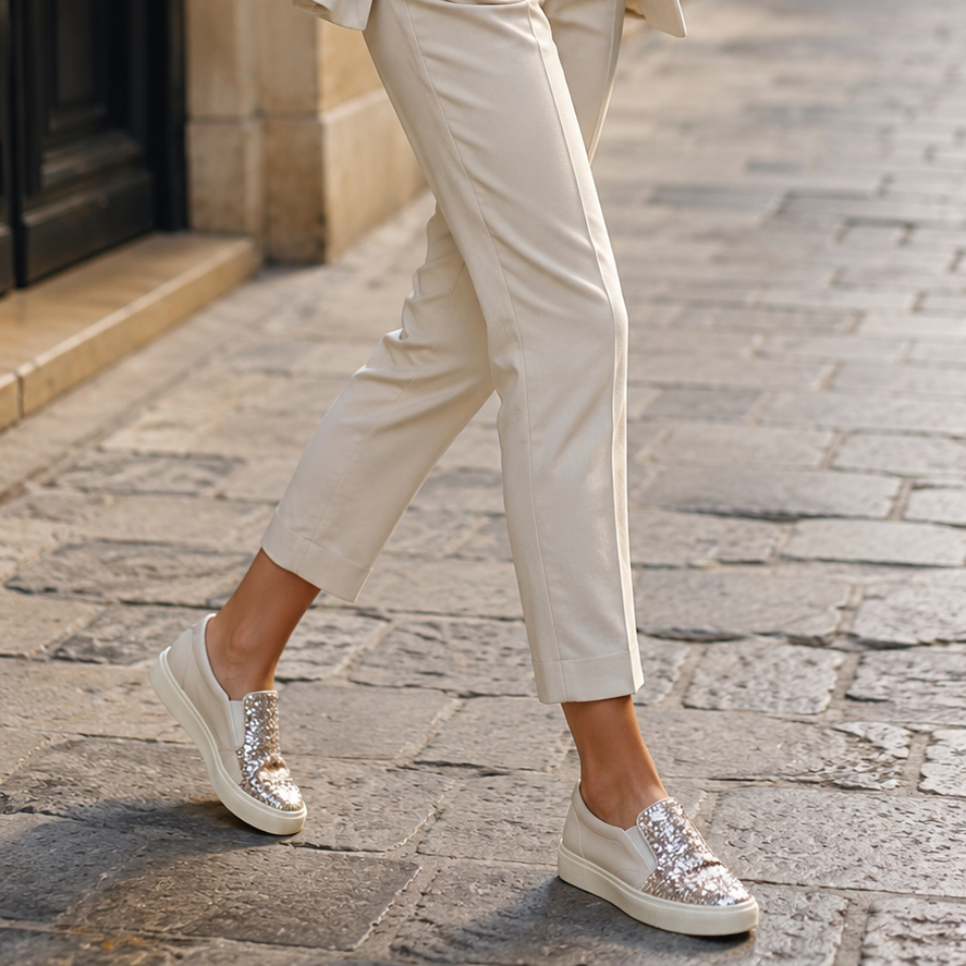
Bedazzled Sneakers — The Glamoratti Twist on Athletic Chic
Bedazzled sneakers marry Pinterest’s Glamoratti maximalism with athletic silhouettes, turning rhinestones, pearls, and glitter into everyday footwear rather than costume. Where minimalist sneaker culture once…
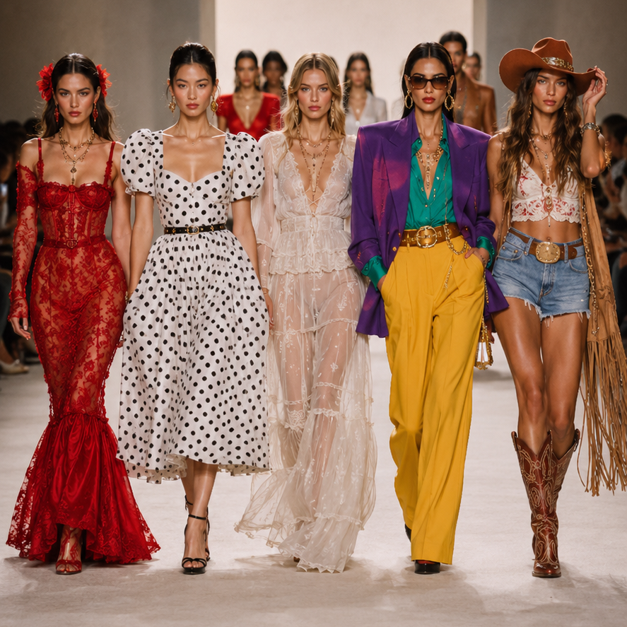
The Summer Fashion Trends That Actually Look Expensive — And the Ones to Skip
Summer 2026 fashion trends are moving away from quiet minimalism and toward bold, expressive, wearable statement dressing. The key trends include cherry red, lace, puff…